DriverDBv4: A database for human cancer driver gene research
Loading...
Summary heatmap
The Gene Summary provides a visualization of different features of a user-selected gene in relation with multiple cancer types.
The right side displays the heatmap of the TCGA dataset, with asterisks within cells indicating identified by multi-omics tools.
On the left side is the heatmap of the non-TCGA dataset.
Loading...
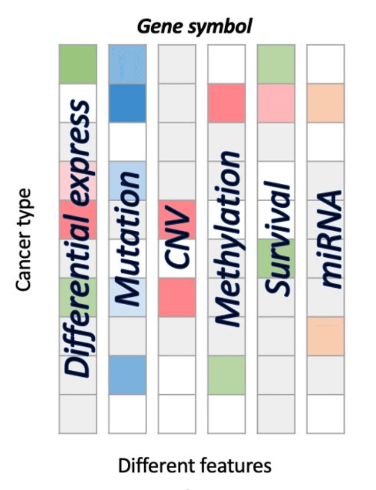
- The Differential expression (DE) squares indicate whether a gene is significant with p value <0.05 and whether it is differentially expressed. Red represents up-regulated genes with log2(fold change) > 1 and green represents down-regulated genes with log2(fold change) < -1.
- The Mutation squares indicate the number of mutation tools which identify this gene as a mutation driver. As the number of tools goes from low to high, the blue color goes from light to deep, correspondingly.
- The Copy Number Variation (CNV) squares indicate CNV gain or loss of a gene. Red represents a gain (1) and green represents a loss (-1).
- The Methylation squares indicate whether the gene is hyper-methylated (1) or hypo- methylated (-1). Red represents hyper and green represents hypo.
- The Survival squares indicate whether this is survival-relevant with log-rank p value < 0.05. Red represents oncogene with log2(hazard ratio) > 0 and green represents tumor suppressor gene with log2(hazard ratio) < 0.
- The miRNA squares indicate the number of miRNAs that interacts with this gene. As the number of miRNA goes from low to high, the orange color goes from light to deep, correspondingly.
The Gene Expression function provides visualizations to illustrate the expression of a user-selected gene across multiple cancer types. Distributions of expression (TPM) in pan-cancer are visualized and stratified by sample types, mutation class, and tumor stages, respectively. Switch between the tabs below to explore results under different grouping conditions.
Visualization of all cancer types
The boxplot shows the distribution of expression of all cancer types for a user-selected gene. The expression are grouped by sample type.
By sample type
Loading...
Visualization of each cancer type
Cancer Type
Loading...
Visualization
Visualization of all cancer types
The boxplot shows the distribution of expression of all cancer types for a user-selected gene. The expression are grouped by sample type(NT_TP).
By sample type(NT_TP)
Loading...
Visualization of each cancer type
Cancer Type
Loading...
Visualization
Visualization of all cancer types
The boxplot shows the distribution of expression of all cancer types for a user-selected gene. The expression are grouped by mutation class.
By mutation class
Loading...
Visualization of each cancer type
Cancer Type
Loading...
Visualization
Visualization of all cancer types
The boxplot shows the distribution of expression of all cancer types for a user-selected gene. The expression are grouped by stage.
By stage
Loading...
Visualization of each cancer type
Cancer Type
Loading...
Visualization
The Gene Mutation function provides visualizations to illustrate mutation statistics in correspondence to protein regions in multiple cancer types. Distributions of mutation rate/percentage and distributions in pan-cancer exons are displayed, respectively. Switch between the tabs below to explore the results.
Visualization of all cancer types
Loading...
Visualization of each cancer type
Cancer Type
Visualization
Loading...
Visualization of all cancer types
Loading...
Visualization of each cancer type
Cancer Type
Visualization
Loading...
Visualization of all cancer types
Loading...
Visualization of each cancer type
Visualization By
Cancer Type
Visualization
Loading...
The Gene CNV function provides visualizations illustrating the copy number gain or loss of a user-selected gene across various cancer types. These visualizations also reveal correlations between CNV and gene expression levels.
Copy number variation in all cancer
This graph shows the copy number variation (CNV) of a user-selected gene in several cancer types. Each gene is analyzed by two CNV tools: iGC and diggit. The sample proportion is shown in the plot when the cancer is identified by one or both of the tools.
Loading...
Visualization of each cancer type
Cancer Type
Visualization
Loading...
CNV Table
The Gene Methylation function provides visualizations to illustrate the methylation type of a user-selected gene across various cancer types. The following section explores the correlations between methylation and gene expression.
Methylation in all cancer
This graph shows the methylation type of a user-selected gene in several cancer types. Each gene is defined by two methylation tools: methylmix and ELMER. The sample proportion is shown in the plot only when the cancer is identified by both tools.
Loading...
Visualization of each cancer type
Cancer Type
Visualization
Loading...
Methylation Table
The Gene Survival function provides visualizations to illustrate the survival probability of a user-selected gene across multiple cancer types. You can explore genes that have a synergistic impact on patient survival with the selected gene.
Single Gene Survival
This table provides detailed survival information of a single gene and also serves as a control panel to produce the Kaplan-Meier plot below.
Survival Table
Loading...
Kaplan-Meier plot
Survival Network
The Gene Survival network illustrates the synergistic effect of a user-selected gene and its related genes. The synergistic effect is defined by the HR of the user-selected gene and its related genes. If the HR of two genes is greater than 1.5 folds of each, these two genes are identified to have a synergistic effect, and are further divided into 2 levels – 1.5 folds and 2 folds; each with a positive and negative direction of HR.
Loading...
Survival of synergistic effect
This section provides all gene pairs (a user-selected genes and its related genes) with HR fold change greater than each single gene in both directions even though only more than 1.5 fold changes are considered to have a synergistic effect between them. For each gene pair, the patients are stratified to two groups based on their expression median. The groups of patients are then compared on their 5-year overall survival (OS) probability over months, as shown in the plots.
Loading...
The Gene miRNA function visualizes the relations between a user-selected gene and miRNAs across various cancer types, showing miRNAs that have been either predicted or validated to regulate the user-selected gene.
miRNA-gene network
The Gene miRNA network illustrates the relations between a user-selected gene and miRNAs. The interactions are defined by 12 prediction tools or experimental validations recorded by miRTarBase. Validated relations are represented by solid lines; predicted relations are represented by dotted lines. Predicted relations can be further filtered by a minimum of 6, 8, or 10 tools.
Loading...
Gene-miRNA table
The Gene Protein function provides visualizations to illustrate the protein expression of a user-selected gene across multiple cancer types. Protein expression distributions, stratified by mutation class, tumor stages, and post-translational modifications, in pan-cancer are shown, respectively. Switch between the tabs below to explore the results based on different stratifies.
Visualization of all cancer types
The boxplot shows the distribution of protein expression of a user-selected gene across all cancer types. The boxplot is displayed according to user-selected PTM (Post-translational modification) on the drop-down menu. The expression is grouped by stages. You can show or hide the corresponding results by clicking on the plot legends. Additional information and statistical values are shown by hovering over the individual boxes.
Loading...
Visualization of mRNA-protein regulation
The bar chart illustrates the relationship between mRNA and protein levels across cancer types by Spearman correlation. The bar chart is displayed according to user-selected PTM (Post-translational modification) on the drop-down menu. Click on a specific bar to view the corresponding correlation scatter plot on the right side. Hover over the boxes to view additional information and statistical values.
Loading...
Visualization of each cancer type
Cancer Type
Visualization by stage
Visualization of all cancer types
The boxplot shows the distribution of protein expression of a user-selected gene across all cancer types. The boxplot is displayed according to user-selected PTM (Post-translational modification) on the drop-down menu. The expression is grouped by mutation classes. You can show or hide the corresponding results by clicking on the plot legends. Additional information and statistical values are shown by hovering over the individual boxes.
Loading...
Visualization of mRNA-protein regulation
The bar chart illustrates the relationship between mRNA and protein levels across cancer types by Spearman correlation. The bar chart is displayed according to user-selected PTM (Post-translational modification) on the drop-down menu. Click on a specific bar to view the corresponding correlation scatter plot on the right side. Hover over the boxes to view additional information and statistical values.
Loading...
Visualization of each cancer type
Cancer Type
Visualization by mutation
Visualization of mRNA-protein regulation
The bar chart illustrates the relationship between mRNA and protein levels across cancer types by Spearman correlation. Click on a specific bar to view the corresponding correlation scatter plot on the right side. Hovering over the boxes, you can view additional information and statistical values.
Loading...
The Gene Multi-omics function provides visualizations to illustrate the user-selected gene by multi-omics data across multiple cancer types. You can explore the connections between different omics data within each cancer and the distribution in pan-cancer.
Visualization of multi-omics integration
This plot illustrates the distribution of records predicted by tools across cancer types and omics. It also reveals the importance of a user-selected gene in multi-omics data.
Loading...
Visualization of omics connection
This diagram illustrates the associations between a user-selected gene, multi-omics, and cancer types. Nodes in the graph with more connections indicate a higher level of influence.
Loading...
List of multi-omics driver events
The table listed the detailed information and results of of multi-omics driver events.
Loading...
Citation
To support the continued development of this resource, please cite the following paper if you use DriverDBv4 in your work.
Chia-Hsin Liu , Yo-Liang Lai , Pei-Chun Shen , Hsiu-Cheng Liu , Meng-Hsin Tsai , Yu-De Wang , Wen-Jen Lin , Fang-Hsin Chen , Chia-Yang Li , Shu-Chi Wang , Mien-Chie Hung , Wei-Chung Cheng (2024).
DriverDBv4: a multi-omics integration database for cancer driver gene research. Nucleic Acids Research, 52(D1), D1246–D1252.
DOI Download citation (.nbib)Contact
Tel: +886-4-2205-3366 #7929
Email:
wccheng@mail.cmu.edu.tw
Address: 5F., No. 350, Sec. 1, Jingmao Rd., Beitun Dist., Taichung City 406040, Taiwan
BioinfOMICS LAB:
http://www.bioinfomics.org/
Copyright© 2010-2025. All Rights Reserved. ©版權所有. Ver. 1.00.003未經允許請勿任意轉載、複製或做商業用途