DriverDBv4: A database for human cancer driver gene research
1. What is DriverDB?
DriverDB is a cancer omics database that integrates somatic mutation, RNA expression, miRNA expression, protein expression, methylation, copy number variation, and clinical data with annotation bases and published bioinformatics algorithms.
DriverDB was featured in the 2014, 2016, and 2020 Nucleic Acids Research Database Issue, applying published bioinformatics algorithms to dedicate driver gene/mutation identification.
The database provides three functions, ‘Cancer,’ ‘Gene,’ and ‘Customized-Analysis,’ to help researchers visualize the relationships between cancers and driver genes.
The ‘Cancer’ function summarizes the calculated results of driver genes in different molecular features using published bioinformatics algorithms/tools for a specific cancer type/dataset.
The ‘Gene’ function visualizes different features of a user-selected gene, including Differential Expression (DE), mutation, CNV, methylation, survival, miRNA, protein, and multi-omics.
The ‘Customized-Analysis’ function offers survival analysis, Multi-omics driver analysis, and subgroup expression plot analysis.
Survival analysis allows researchers to select a sub-group of well-defined cancer samples based on one or multiple clinical parameters for driver gene identification.
The multi-omics driver analysis identifies and explores the multi-omics drivers associated with user-defined groups of patients.
The subgroup expression analysis visualizes gene expression patterns concerning specific clinical factors.
2. Section One - Cancer
The ‘Cancer’ section summarizes the calculated results of driver genes in different molecular features using published bioinformatics algorithms/tools for a specific cancer type/dataset.
Dataset selection panel Browse by tissue type
In this section, DriverDBv4 offers 70 datasets by querying the following drop-down panels:
(A). users can search for a specific dataset by browsing tissue types;
(B). users can select a dataset released by different cancer types.
Press Submit to view driver gene information of multiple features in a specific cancer type.
2.1. Cancer Summary
The Cancer Summary section provides a Summary network which integrates cancer dysfunction and dysregulation events in a multi-omics level, and a Functional Annotation analysis of these cancer driver genes.
2.1.1. Cancer summary network
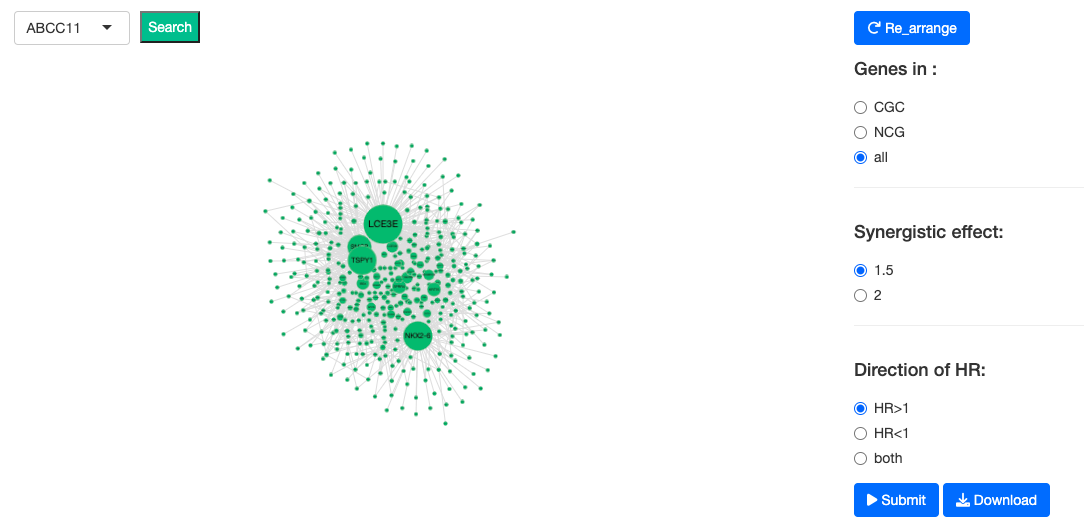
The Cancer Summary network presents the relationships between driver genes and miRNA drivers in a specific cancer type. The resources of gene dataset include the Cancer Gene Census (GCG) and the Network of Cancer Genes (NGC6.0). Driver genes possess various features and are denoted by nodes gridded with colors (as shown in the legend figure); miRNA drivers are denoted by yellow nodes.
These nodes are connected by lines to show the protein-protein interactions (PPIs) in the STRING database and synergistic effects, defining by which hazard ratio (HR) of two genes is greater than 1.5 fold of each gene. All of these factors can be adjusted by toggling the options of the control panel on the right-hand side.
2.1.2. Driver summary table
In this table, the relevant genes of user-selected cancer type are listed with numerous information. For example, whether the gene was recorded on CGC database or NCG6.0 database. The numbers of mutations, CNV, methylation, miRNA data are there in each gene.
2.2. Cancer Mutation
The Cancer Mutation function provides visualizations to illustrate the mutation drivers identified by bioinformatics tools in a specific cancer type.
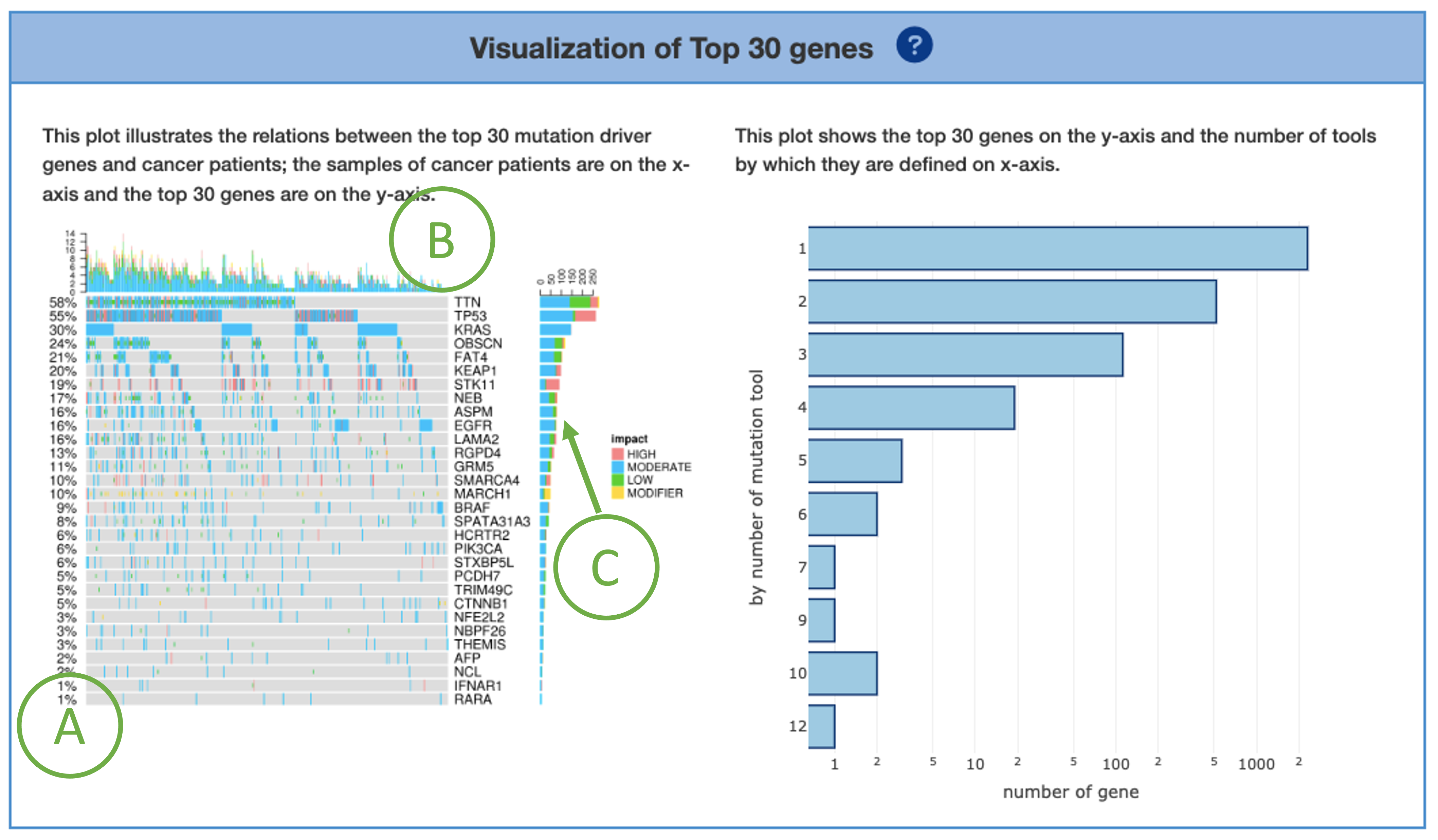
2.2.1. Visualization of Top 30 genes
A plot is provided on the left to illustrate the relations between the top 30 mutation driver genes and cancer patients. The x-axis represents samples of cancer patients; the y-axis lists the top 30 genes. The percentages shown on the left of the plot represents the total percentage of mutation in the samples for each mutation drivers (A). The bar charts on the top (B) and right (C) calculate the total of mutation occurrences by column (each sample) and by row (each mutation driver), respectively. The impact is categorized as ‘High’, ‘Moderate’, ‘Low’, ‘Modifier’. These are just pre-defined categories to help users find more significant variants, not to predict which variant is the one producing a phenotype of interest.
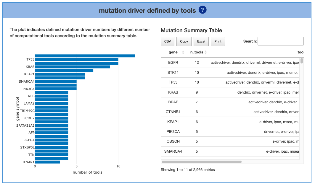
2.2.2. Mutation driver defined by tools
The left part shows the driver genes that were identified by tools. The mutation drivers that were defined by more tools indicated higher confidence. The number of genes is set by the users by adjusting the top bar. A table of genes and the detailed information of the tools is also provided below.
2.3. Cancer CNV
This section provides visualized information about the copy number variation (CNV) in a selected cancer type. By using multiple bioinformatics tools, the graphs display Top 30 genes and present the CNV gain or loss status as well as the details of locus enrichment. All of the following analyses can be adjusted by selecting one or two defining tools.
2.3.1. Visualization of Top 30 genes
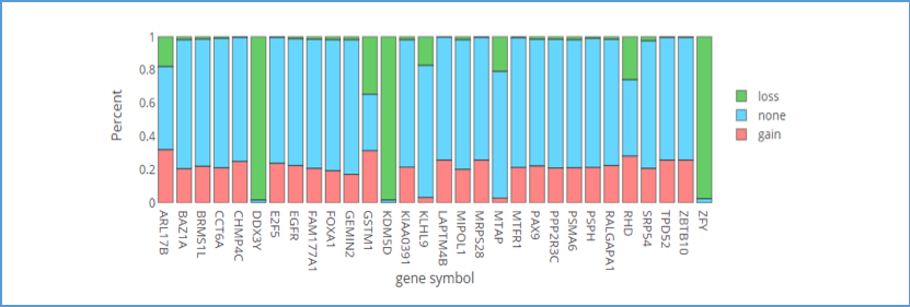
This bar chart provides an overview of the copy number variation (CNV) percentages for the top 30 genes. If you move the mouse over the bar of genes, the details of the percentage CNV will be shown in a tooltip. Green areas represent CNV loss; pink areas represent CNV gain; blue areas represent none CNV.
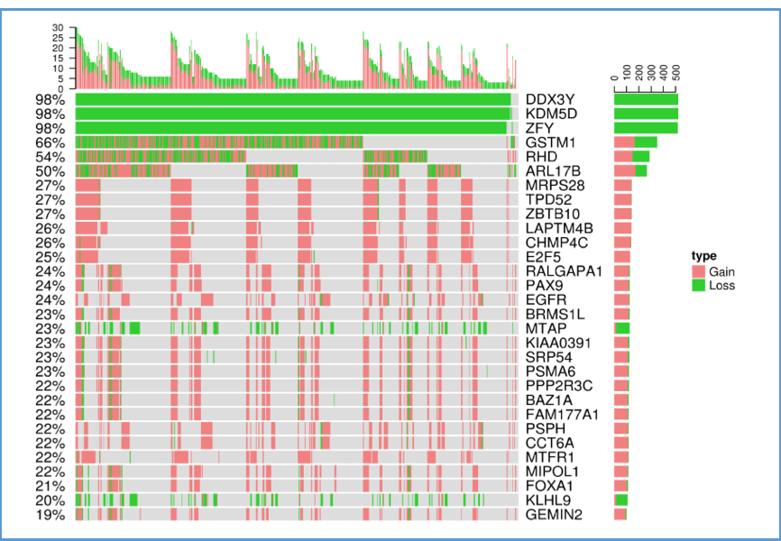
This plot illustrates the relations between the top 30 genes and their CNV in cancer patients for a certain cancer type. The x-axis represents samples of cancer patients; the y-axis lists the top 30 genes. The bar charts on the top and right calculate the total CNV occurrences by column (each sample) and by row (each gene), respectively. Green areas represent CNV loss; pink areas represent CNV gain.
2.3.2. Locus enrichment
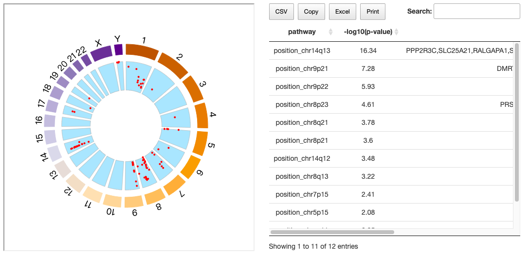
The graph shows the loci of all genes within all chromosomes. Each red dot represents a gene and its related position on the chromosome; move your mouse over the various genes to see chromosome, position, value and name of genes. The value represents the correlation between RNA expression and CNV. If the value is positive, it shows there are copy number gain/loss, further influencing the expression of miRNA.
The details of locus enrichment results are also provided on the right
2.3.3. CNV table
The table comprises comprehensive information of CNV, including GENE name, ensg, iGC_gain_p_value, iGC_gain_fdr, iGC_loss_p_value, iGC_loss_fdr, iGC_gain_sample_prop, iGC_normal_sample_prop, iGC_loss_sample_prop, iGC_gain_log2FC, iGC_loss_log2FC, diggit_spearman.pval, spearman_cor, spearman_pv.
2.4. Cancer Methylation
This section provides visualized information about the degree of hyper/hypomethylation of different genes in a selected cancer type. By using multiple bioinformatics tools, the graphs display Top 30 genes and present the methylation status as well as the details of locus enrichment. All of the following analyses can be adjusted by selecting one or two defining tools.
2.4.1. Visualization of Top 30 genes
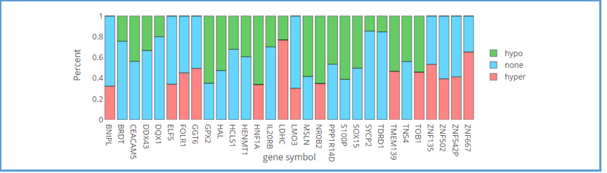
This bar chart provides an overview of the methylation percentages for each of the top 30 genes. Green areas represent hypomethylation; pink areas represent hypermethylation; blue areas represent non-methylation. As always, moving the mouse over the bar of the gene shows the details of the percentage of methylation in a tooltip.
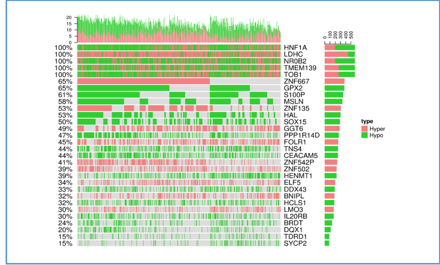
The following plot illustrates the relations between the top 30 genes and their methylation type in cancer patients for a certain cancer type. The x-axis represents samples of cancer patients; the y-axis lists the top 30 genes. The bar charts on the top and right calculate the total methylation occurrences by column (each sample) and by row (each gene), respectively. Green areas represent hypomethylation; pink areas represent hypermethylation.
2.4.2. Locus enrichment
This graph shows the loci of each gene within each chromosome. Each red dot represents a gene and its related position on the chromosome; move your mouse over the various genes to see chromosome, position, value and name of genes. The value represents the correlation between RNA expression and methylation status. If the value is negative, it indicates there are hyper/hypomethylation, further influencing the expression of miRNA. A table of pathways and detailed information of p-value and involved genes is also provided on the right.
2.4.3. Methylation table
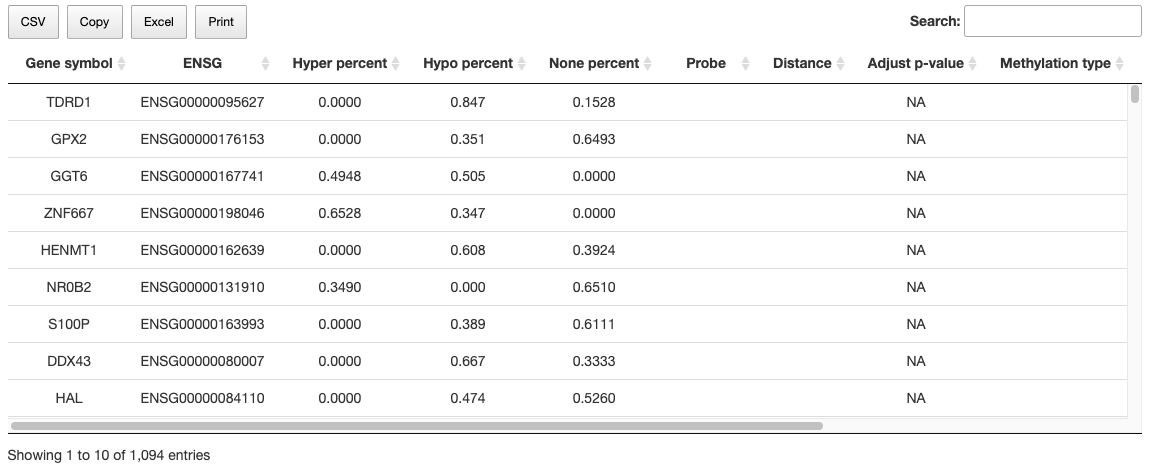
Methylation relevant factors are listed in the table, comprising gene_symbol, ensg, methylmix_hyper_percent, methylmix_none_percent, methylmix_hypo_percent, Probe, Distance, Pe, MET_type_by_ELMER, spearman_cor, spearman_pv.
2.5. Cancer Survival
The Cancer Survival function provides visualizations to illustrate the Survival network and Survival of synergistic effect identified by bioinformatics tools in a specific cancer type.
2.5.1. Survival network
The Cancer Survival network illustrates the synergistic effect between significant survival-relevant genes. Firstly, the gene can be chosen from CGC database, NCG6.0 database, or both. Next, if individual genes’ HR both are >1 or <1, the system will calculate their synergistic effect. On the contrary, if the HR of two genes opposite direction, they won’t be included in the plot. Lastly, the synergistic effect is defined by the combined hazard ratio (HR) of two genes and has 2 levels – 1.5 folds and 2 folds. These folds mean that the combined hazard ratio is 1.5 folds or double than the hazard ratio of a single gene.
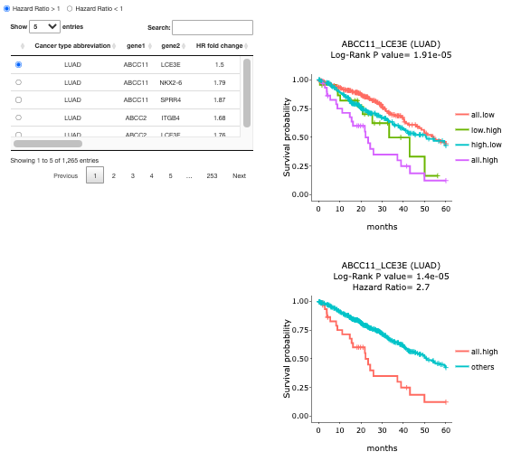
2.5.2. Survival of Synergistic effect
A table of cancer types with gene pairs is provided for each direction of HR. Toggling the desired gene pairs on the table generates corresponding survival plots on the right. On the right-hand side, two figures display the survival probability of the paired gene. Log-Rank P-value and Hazard Ratio elucidate the significance of the difference. The explanations of the abbreviations are shown below.
All.high = patients with high expression in both gene1 and gene2
Other = patients with other combinations
All.low = patients with low expression in both gene 1 and gene 2
Low.high = patients with low expression in gene 1 but high expression in gene 2
High.low = patients with high expression in gene 1 but low expression in gene 2
2.6. Cancer miRNA
The Cancer miRNA function provides visualizations to illustrate the Gene-miRNA network and Visualization of differentially expressed gene and miRNA, identified by bioinformatics tools in a specific cancer type.
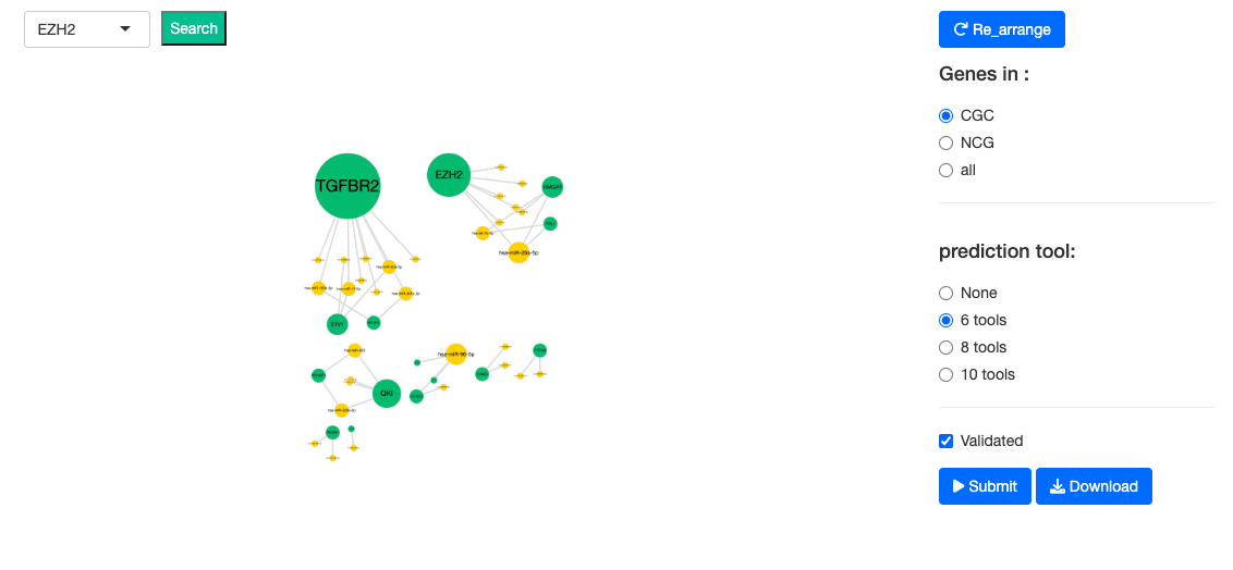
2.6.1. Cancer miRNA network
The Cancer miRNA network illustrates the relations between the genes and miRNAs of a user-selected Cancer type. Validated relations are represented by solid lines; whereas predicted relations are represented by dotted lines. The nodes colored in green represent the genes; the nodes colored in yellow represent the miRNA. Predicted relations can be further filtered by a minimum of 6, 8, or 10 tools.
- ‘Validated relations’ are validated miRNA-target interactions recorded in miRTarbase (1).
- ‘Predicted relations’ are the interactions defined by 12 prediction tools, including DIANA-microT (2), MicroT4 (3), miRBridge (4), miRDB (5), miRMap (6), PITA (7), RNAhybrid (8), TargetScan (9), PICTAR2 (10), RNA22 (11), miRWalk (12) and miRanda (13).
Reference:
(1) Chou C.H., Chang N.W., Shrestha S., Hsu S.D., Lin Y.L., Lee W.H., Yang C.D., Hong H.C., Wei T.Y., Tu S.J., et al. miRTarBase 2016: updates to the experimentally validated miRNA-target interactions database. Nucleic Acids Res. 2016;44:D239–D247.
(2) Paraskevopoulou M.D., Georgakilas G., Kostoulas N., Vlachos I.S., Vergoulis T., Reczko M., Filippidis C., Dalamagas T., Hatzigeorgiou A.G. DIANA-microT web server v5.0: service integration into miRNA functional analysis workflows. Nucleic Acids Res. 2013;41:W169–W173.
(3) Maragkakis M., Vergoulis T., Alexiou P., Reczko M., Plomaritou K., Gousis M., Kourtis K., Koziris N., Dalamagas T., Hatzigeorgiou A.G. DIANA-microT Web server upgrade supports Fly and Worm miRNA target prediction and bibliographic miRNA to disease association. Nucleic Acids Res. 2011;39:W145–W148.
(4) Tsang J.S., Ebert M.S., van Oudenaarden A. Genome-wide dissection of microRNA functions and cotargeting networks using gene set signatures. Mol. Cell. 2010;38:140–153.
(5) Wong N., Wang X. miRDB: an online resource for microRNA target prediction and functional annotations. Nucleic Acids Res. 2014;43:D146–D152.
(6) Vejnar C.E., Zdobnov E.M. miRmap: Comprehensive prediction of microRNA target repression strength. Nucleic Acids Res. 2012;40:11673–11683.
(7) Kertesz M., Iovino N., Unnerstall U., Gaul U., Segal E. The role of site accessibility in microRNA target recognition. Nat. Genet. 2007;39:1278–1284.
(8) Kruger J., Rehmsmeier M. RNAhybrid: microRNA target prediction easy, fast and flexible. Nucleic Acids Res. 2006;34:W451–W454.
(9) Shin C., Nam J.W., Farh K.K., Chiang H.R., Shkumatava A., Bartel D.P. Expanding the microRNA targeting code: functional sites with centered pairing. Mol. Cell. 2010;38:789–802.
(10) Shin C., Nam J.W., Farh K.K., Chiang H.R., Shkumatava A., Bartel D.P. Expanding the microRNA targeting code: functional sites with centered pairing. Mol. Cell. 2010;38:789–802.
(11) Miranda K.C., Huynh T., Tay Y., Ang Y.S., Tam W.L., Thomson A.M., Lim B., Rigoutsos I. A pattern-based method for the identification of MicroRNA binding sites and their corresponding heteroduplexes. Cell. 2006;126:1203–1217.
(12) Enright A.J., John B., Gaul U., Tuschl T., Sander C., Marks D.S. MicroRNA targets in Drosophila. Genome Biol. 2003;5:R1.
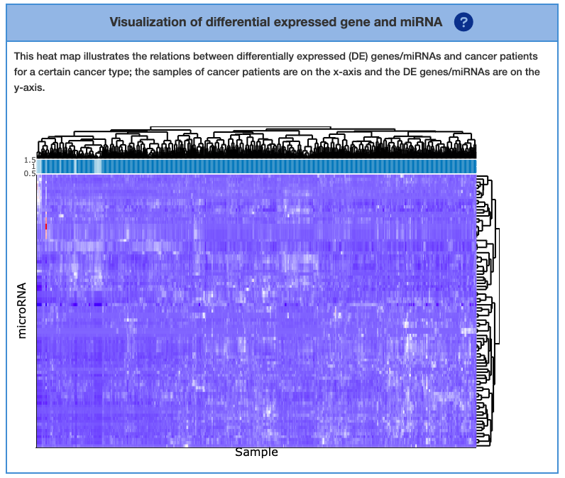
2.6.2. Visualization of differential expressed gene and miRNA
This section visualizes the association between differentially expressed (DE) gene or miRNA and different patient plus healthy individuals. The heatmap on the right column can show DE genes on a per-sample basis, DE miRNA on a per-sample basis, or both. This can be toggled in the ‘Visualization by’ column. The X-axis of the heatmap represents a different individual. The intensity of the red/blue colors represents the expression level. The top and right dendrogram indicate the similarity of symbols or patients. The bar of sample below dendrogram encompasses sample ID. “TP” means tumor sample, which is in dark blue. “NT” means normal sample, which is in light blue.
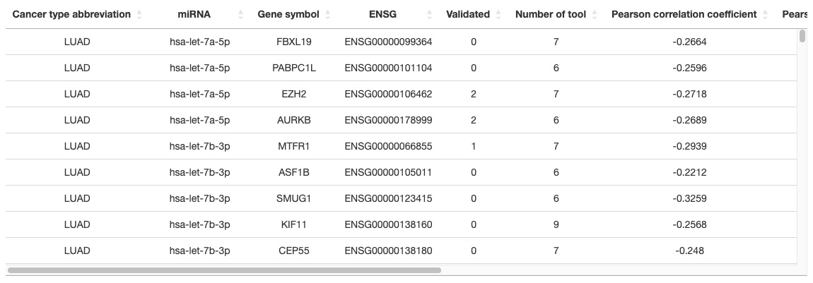
2.6.3. Gene - miRNA table
More analyzed results are shown in the table, including Cancer type abbreviation, miRNA, Gene symbol, ENSG, Validated, Number of tools, Pearson correlation coefficient, Pearson p-value, Spearman correlation coefficient, Spearman p-value, Kendall correlation coefficient, Kendall p-value.
2.7. Cancer Multi-omics
The Cancer Multi-omics function provides visualizations illustrate genes identified from mRNA, miRNA, CNV, mutation, and methylation of a specific cancer type.
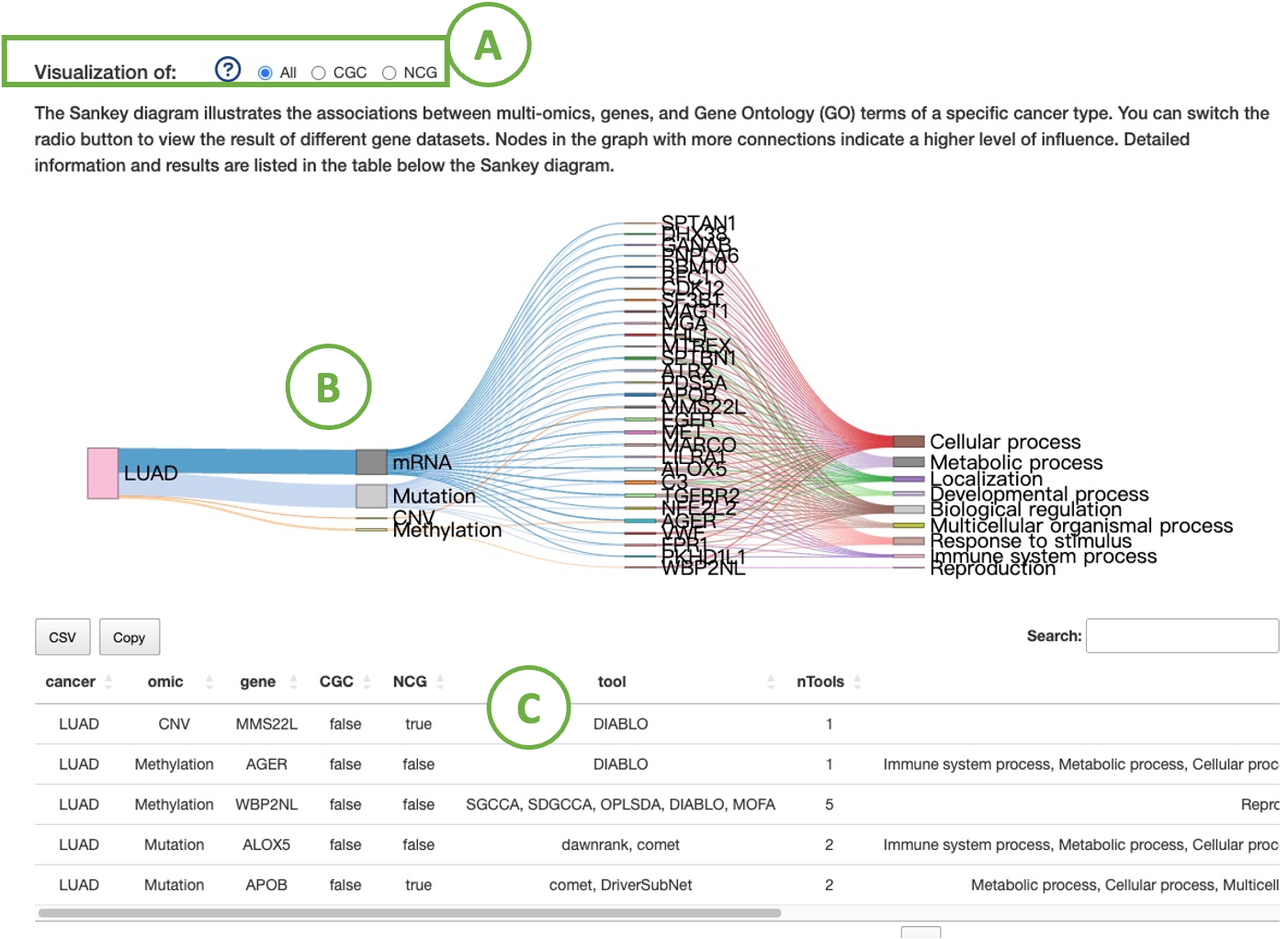
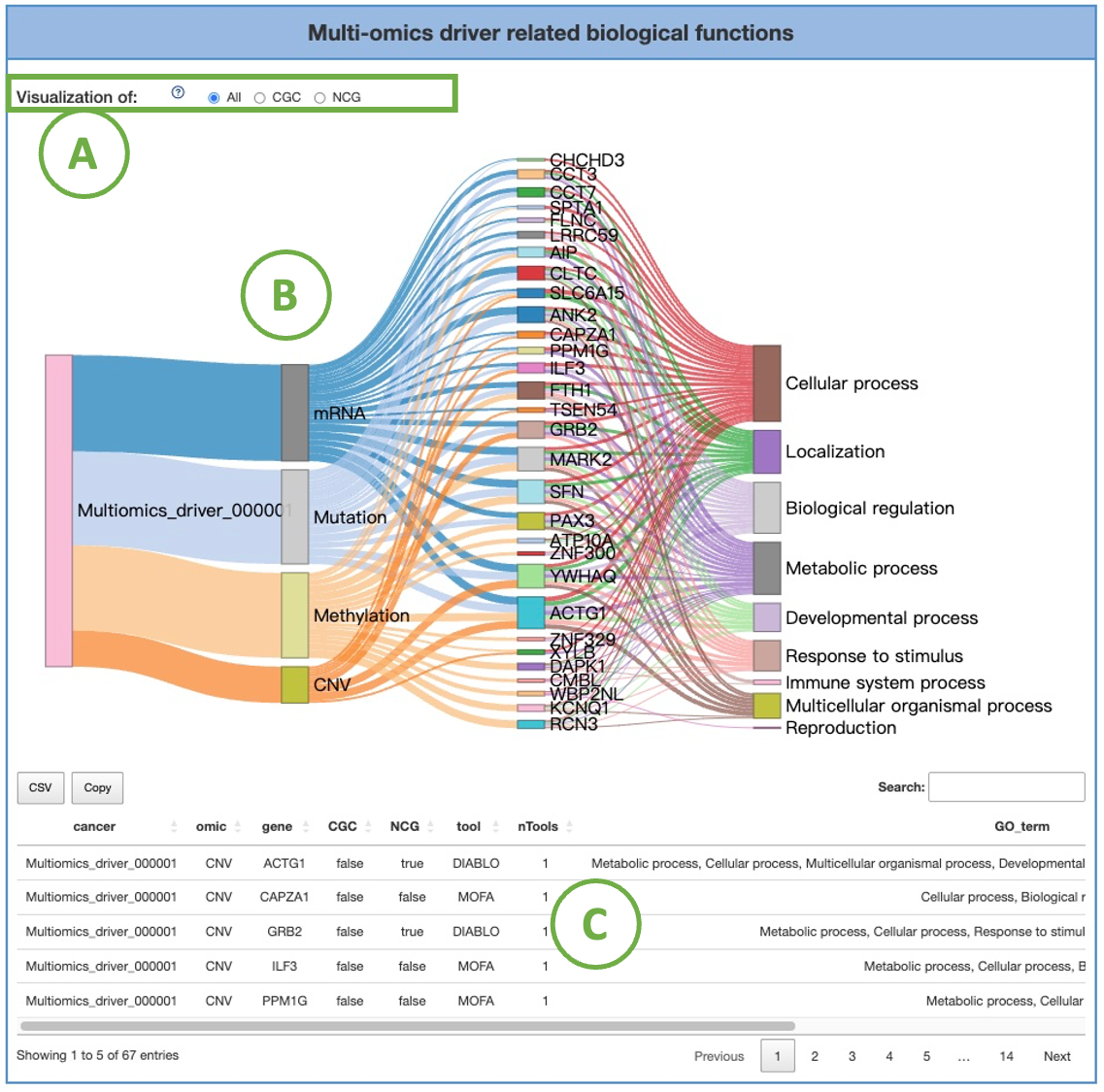
2.7.1. Multi-omics driver related biological functions
The diagram (B) illustrates the associations between a specific cancer type's multi-omics, genes, and Gene Ontology (GO) terms. You can switch the radio button (A) to view the result of different gene datasets.
Nodes in the graph with more connections indicate a higher level of influence. Detailed information and results are listed in the table (C) below the diagram.
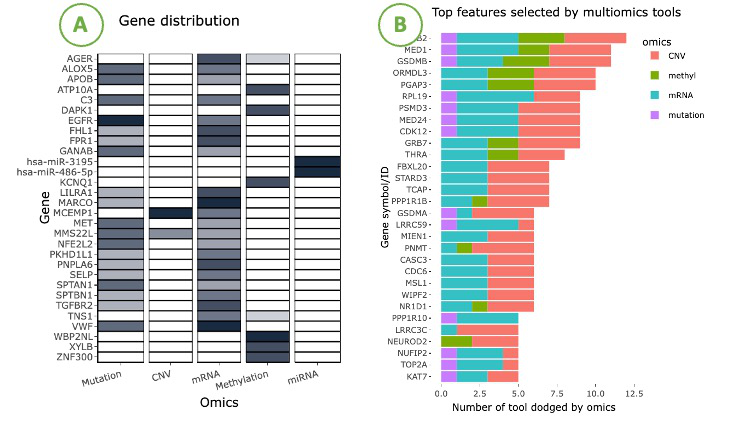
2.7.2. Visualiztion of multi-omics drivers distribution
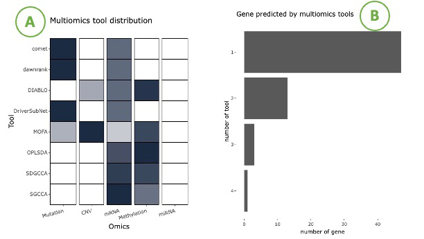
The visualizations display the adopted tools and the identified driver genes of five omics, mRNA, miRNA, CNV, mutation, and methylation.
The left heatmap (A) visualizes the correlation between genes and omics. The x-axis represents the omics level, while the y-axis represents the gene symbol.
By hovering over a specific cell in the heatmap, you can view the number of tools identifying that particular gene.
The right bar chart (B) displays the top genes selected by the most tools. The x-axis represents the number of tools, while the y-axis represents the gene symbol. The bar colors distinguish the four omics.
Hovering over a bar lets you view the number of tools identifying that specific gene of a particular omics.
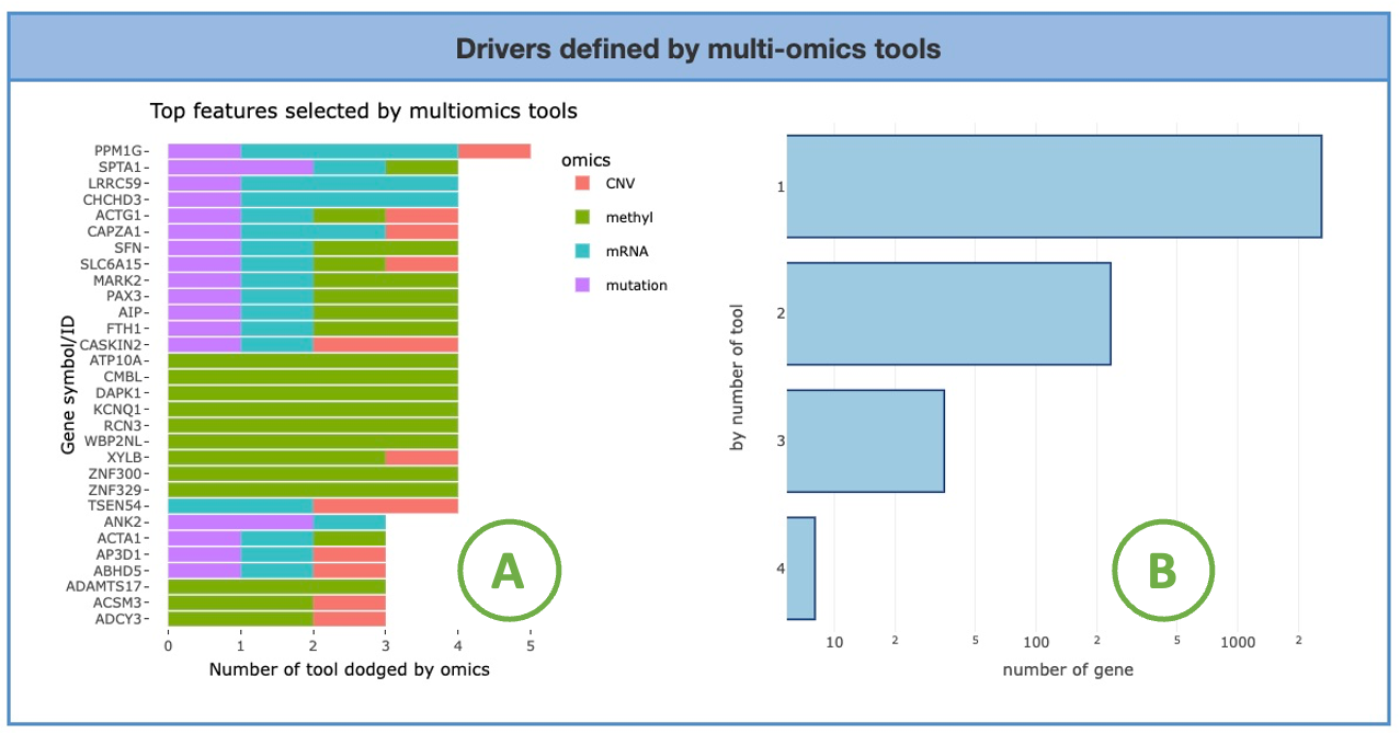
2.7.3. Drivers defined by multi-omics tools
The visualizations display the number of genes selected by multi-omics tools.
You can access the multi-omics tools utilized in this analysis by clicking on the hyperlinked phrase "multi-omics tools" in the description, as depicted in the screenshot below.
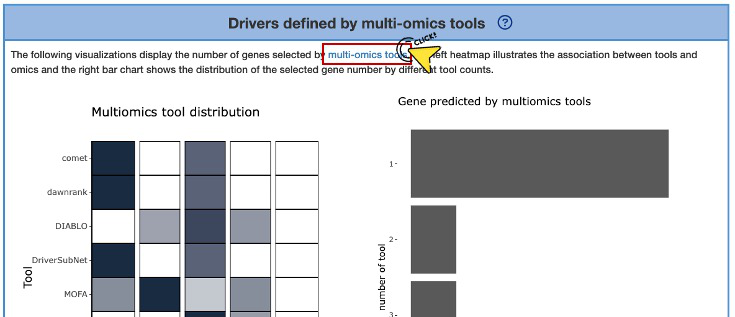
The left heatmap (A) illustrates the association between tools and omics. The x-axis represents the omics level, while the y-axis represents the identification tools.
By hovering over a specific cell in the heatmap, you can view the proportion in omics of the tool.
The right bar chart (B) shows the distribution of the selected gene number based on different tool counts. The x-axis represents the number of tools, while the y-axis represents the number of genes.
By hovering over a bar, you can view the number of genes identified corresponding to a specific tool count.
3. Section Two - Gene
In this section, researchers can visualize the mutation data for a specific protein encoded by a gene in seven aspects: Summary, Expression, Hotspot, Mutation, CNV, Methylation, Survival and miRNA.
Gene Search
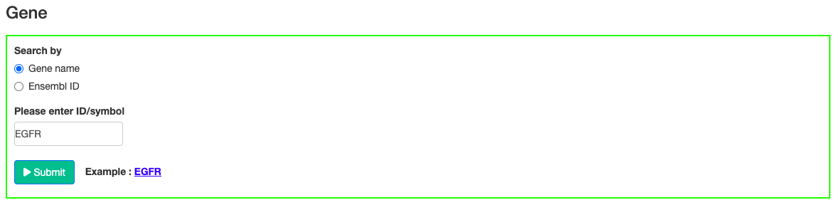
Gene search by inputting HGNC gene symbol or Ensembl ID.
3.1. Gene Summary
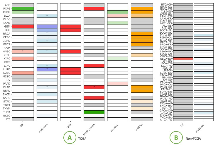
The Gene Summary provides a visualization of different features of a user-selected gene in relation to the cancer types.
The features contain Differential expression (DE), Mutation, Copy Number Variation (CNV), Methylation, Survival and miRNA.
The Gene Summary provides a visualization of different features of a user-selected gene in relation with multiple cancer types.
The right side displays the heatmap of the TCGA dataset, with asterisks (*) within cells indicating identified by multi-omics tools. On the left side is the heatmap of the non-TCGA dataset.
The Differential expression (DE) squares indicate whether a gene is significant with p-value <0.05 and whether it is differentially expressed. Red represents up-regulated genes with log2(fold change) > 1 and green represents down-regulated genes with log2(fold change) < -1.
The Mutation squares indicate the number of mutation tools which identify this gene as a mutation driver. As the number of tools goes from low to high, the blue color goes from light to deep, correspondingly.
The Copy Number Variation (CNV) squares indicate CNV gain or loss of a gene. Red indicates gains with respect to the reference genome (1) and the green represents a loss (-1).
The Methylation squares indicate whether the gene is hyper-methylated (1) or hypomethylated (-1). Red represents hyper and green represents hypo.
The Survival squares indicate whether this is survival-relevant with log-rank p-value < 0.05. Red represents oncogene with log2(hazard ratio) > 0 and green represents tumor suppressor gene with log2(hazard ratio) < 0.
The miRNA squares indicate the number of miRNAs that interacts with this gene. As the number of miRNA goes from low to high, the orange color goes from light to deep, correspondingly.
For those are not significant in the analysis, the squares are colored in grey; Others that has no data for some cancer types are colored in white.
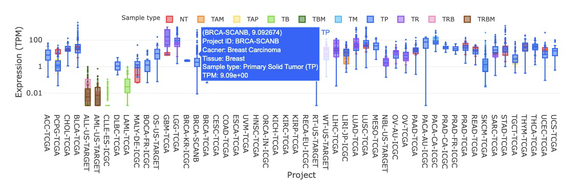
3.2. Gene Expression
The expression profiles of the gene across cancer types by sample type, sample type(NT_TP), mutation class, and stage are illustrated by boxplots. Users can easily view expression results grouped by different criteria by switching between tabs.

3.2.1. By sample type
3.2.1.1 Visualization of all cancer types
The boxplot displays the expression distribution of a user-selected gene by sample types in different cancer types. By clicking on the sample type legends, you can show or hide the results for a specific sample type.
Hovering over the boxes, you can view additional information such as the project ID, cancer type, tissue, and IQR (interquartile range) of expression level.
3.2.1.2 Visualization of each cancer type
This plot provides a more detailed view of the distribution of expression within a single cancer type. Selecting the desired cancer type from the table on the left (A) will generate a corresponding expression plot (B) on the right. A table displaying the relevant statistical values will also be generated below (C).
To focus on specific sample types, you can click on the legends within the plot to show or hide the results of a particular sample type. Furthermore, hovering over the plot provides more detailed information about a specific sample type.
The expression is based on the selected cancer type. The visualization of expression will be grouped by one to multiple sample types, including Additional Metastatic, Additional New Primary, Metastatic, Primary Blood-Derived Cancer, Primary Solid Tumor, Recurrent Solid Tumor, and Solid Tissue Normal.
3.2.2. By sample type(NT_TP)
3.2.2.1 Visualization of all cancer types
The boxplot displays the expression distribution of a user-selected gene by sample types (NT_TP) in different cancer types. By clicking on the sample type legends, you can show or hide the results for a specific sample type. Hovering over the boxes, you can view additional information such as the project ID, cancer type, tissue, and IQR (interquartile range) of expression level.
3.2.2.2 Visualization of each cancer type
This plot provides a more detailed view of the distribution of expression within a single cancer type. Selecting the desired cancer type from the table on the left (A) will generate a corresponding expression plot (B) on the right. A table displaying the relevant statistical values will also be generated below (C).
To focus on specific sample types, you can click on the legends within the plot to show or hide the results of a particular sample type. Furthermore, hovering over the plot provides more detailed information about a specific sample type.
3.2.3. By mutation class
3.2.3.1 Visualization of all cancer types
The boxplot displays the expression distribution of a user-selected gene by mutation classes across different cancer types. You can show or hide the results for a specific mutation class by clicking on the mutation class legends. Hovering over the boxes, you can view additional information such as the project ID, cancer type, tissue, and IQR (interquartile range) of expression level.
3.2.3.2 Visualization of each cancer type
This plot provides a more detailed view of the distribution of expression within a single cancer type. Selecting the desired cancer type from the table on the left (A) will generate a corresponding expression plot (B) on the right. A table displaying the relevant statistical values will also be generated below (C).
To focus on a specific mutation class, you can click on the legends within the plot to show or hide the results of a particular mutation class. Furthermore, hovering over the plot provides more detailed information about a specific mutation class.
The expression is based on the cancer type. The visualization of expression will be grouped by mutation classes, including HIGH, LOW, MODERATE, MODIFIER, Normal Tissue, Tumors without Mutation. By comparing the p-value of group1 between group2, users can see whether there is a difference between each of the mutation class. For instance, the LOW-impact mutation group has significant expression difference from the Normal Tissue.
3.2.4. By stage
3.2.4.1 Visualization of all cancer types
The boxplot displays the expression distribution of a user-selected gene by stages across different cancer types. You can show or hide the results for a specific stage by clicking on the stage legends.
Hovering over the boxes, you can view additional information such as the project ID, cancer type, tissue, and IQR (interquartile range) of expression level.
3.2.4.2 Visualization of each cancer type
This plot provides a more detailed view of the distribution of expression within a single cancer type. Selecting the desired cancer type from the table on the left (A) will generate a corresponding expression plot (B) on the right. A table displaying the relevant statistical values will also be generated below (C).
To focus on specific sample types, you can click on the legends within the plot to show or hide the results of a particular stage. Furthermore, hovering over the plot provides more detailed information about a specific stage.
3.2.3. Gene Mutation
The Gene Mutation section provides a visualization of the Mutation Rate, Mutation Percentage, and Exon within a user-selected gene in relation to multiple cancer types. Users can easily view results grouped by visualizing methods by switching between tabs.
3.2.3.1. Mutation Rate
3.2.3.1.1. Visualization of all cancer types
This graph shows the regions of the protein that are identified as the hotspot mutation regions (HMRs) across several cancer types. The X-axis of the heatmap represents different position of a chosen protein. The intensity of the yellow/purple colors represents the frequency of mutation. The top graph indicates the mutation rate in each position. More details are shown in the tooltips by moving mouse over, including the number of bioinformatic tools that identify the mutation.
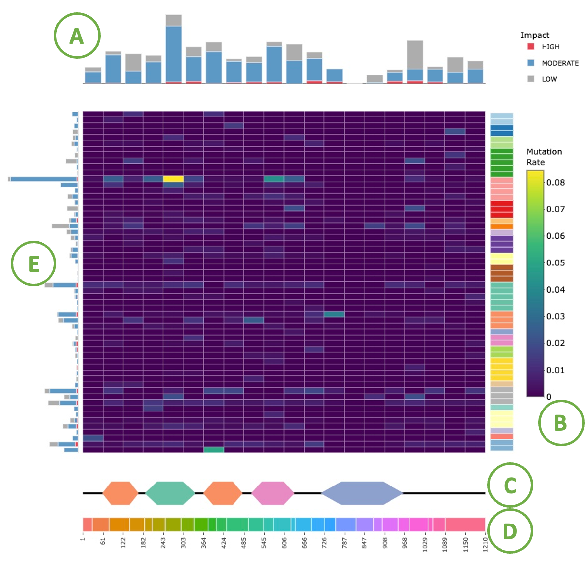
- The barplot for the regions identified as HMRs.
- The regions of the protein identified as HMRs across different cancer types.
- Domain information with protein coordinates.
- Each color represents an exon and the coordinate represents the location of the exons
- The mutation rate barplot of each cancer type
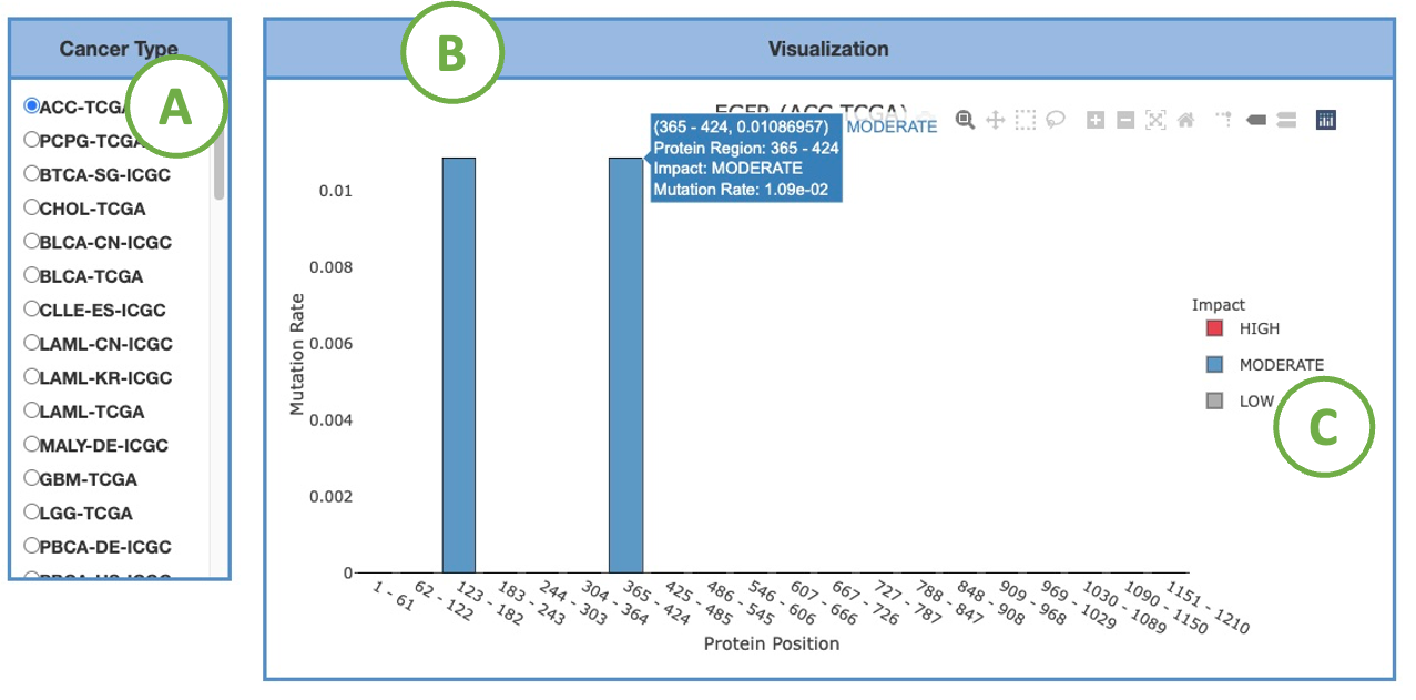
3.2.3.1.2. Visualization of each cancer type
This bar chart provides a more detailed view of the HMRs identified by four methods in a chosen cancer type. Select the desired cancer type on the table (A) to generate the corresponding bar chart on the right (B).
You can hover the mouse over a bar to view detailed information.
To focus on a specific impact, click on the legends (C) within the plot to show or hide the corresponding results.
3.2.3.2. Mutation_percent
3.2.3.2.1. Visualization of all cancer types
This heat map indicates the mutation percentage of a given protein at different positions in several cancer types. (Percentage of mutation = mutation count/total mutation count) The heights of the two bar charts at the left and the top of the heat map are normalized to the mutation count of a cancer type or a protein region, respectively. More details are shown in the tooltips by moving mouse over.
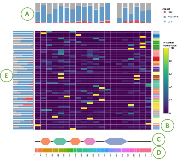
- The cumulative counts for the regions identified as HMRs.
- The regions of the protein identified as HMRs across different cancer types.
- Domain information with protein coordinates.
- Each color represents an exon and the coordinate represents the location of the exons
- The mutation percentage barplot of each cancer type
3.2.3.2.2. Visualization of each cancer type
This bar chart provides a more detailed view of the HMRs identified by four methods in a chosen cancer type. Select the desired cancer type on the table (A) to generate the corresponding bar chart on the right (B).
You can hover the mouse over a bar to view detailed information.
To focus on a specific impact, click on the legends (C) within the plot to show or hide the corresponding results.
3.2.3.3. Exon
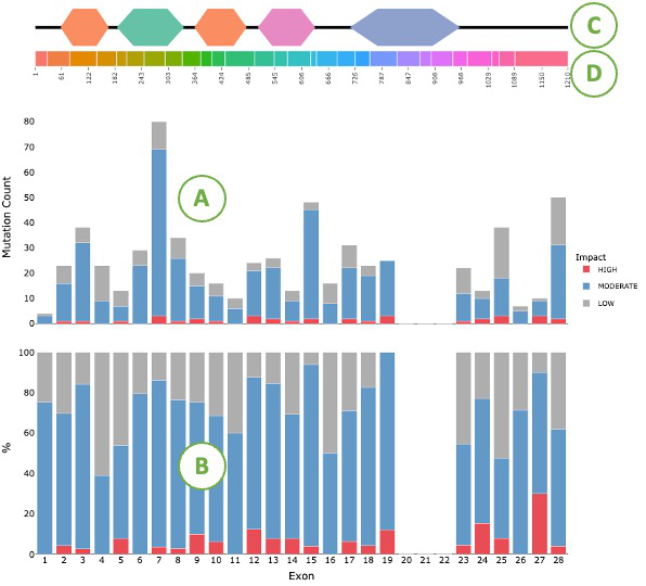
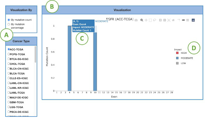
3.2.3.3.1. Visualization of all cancer types
The top of the plot shows the domains(C) and the exon positions(D) of user-assigned protein. The bar charts below show the mutation count (A) and mutation percentage (B) across exons for all cancer types. The blue color indicates that the mutation is attributed to moderate impact. The gray color indicates a low impact. The red color indicates high impact.
3.2.3.3.2. Visualization of each cancer type
This bar chart (B) represents the mutation statistics across exons within each cancer type gene selected by the user from the left panel (A). Select the desired cancer type on the table to generate a corresponding bar chart on the right. The statistics could be visualized in 2 ways: by mutation count or by mutation percentage based on user selection. The colors of bars indicate the impacts of mutation, which comprise three levels, red for high, blue for moderate, gray for low (D). The Y-axis presents the rate of mutation. The X-axis shows the protein position of the mutation. More details are shown in the tooltips by moving the mouse over (C).
3.3. Gene CNV
The Gene CNV section provides a visualization of the Copy Number Variation within a user-selected gene in relation to multiple cancer types.
3.3.1. Copy number variation in all cancer
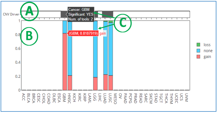
This graph shows the copy number variation (CNV) of a user-selected gene in several cancer types. Each gene is analyzed by two CNV tools: iGC (1) and DIGGIT (2). The sample proportion is shown in the plot when the cancer is identified by one or both of the tools. On top of the bar chart, CNV Driver (A) presents the number of tools that identified the CNV in the specific cancer types and whether it is significant. If it is only identified by iGC, CNV driver will show in light grey, while dark grey implied that it is identified by both tools. The bottom part of the chart indicates the loss/gain copy number status (B). The green color represents loss copy number; red is gain copy number; blue represents no copy number change. More details related to analyses and tools can be found in tooltips when moving the mouse over the bars (C).
Reference:
(1) Lai, Y.P., Wang, L.B., Wang, W.A., Lai, L.C., Tsai, M.H., Lu, T.P. and Chuang, E.Y. (2017) iGC-an integrated analysis package of gene expression and copy number alteration. BMC Bioinformatics, 18, 35.
(2) Alvarez, M.J., Chen, J.C. and Califano, A. (2015) DIGGIT: a Bioconductor package to infer genetic variants driving cellular phenotypes. Bioinformatics, 31, 4032-4034.
3.3.2. Visualization of each cancer types
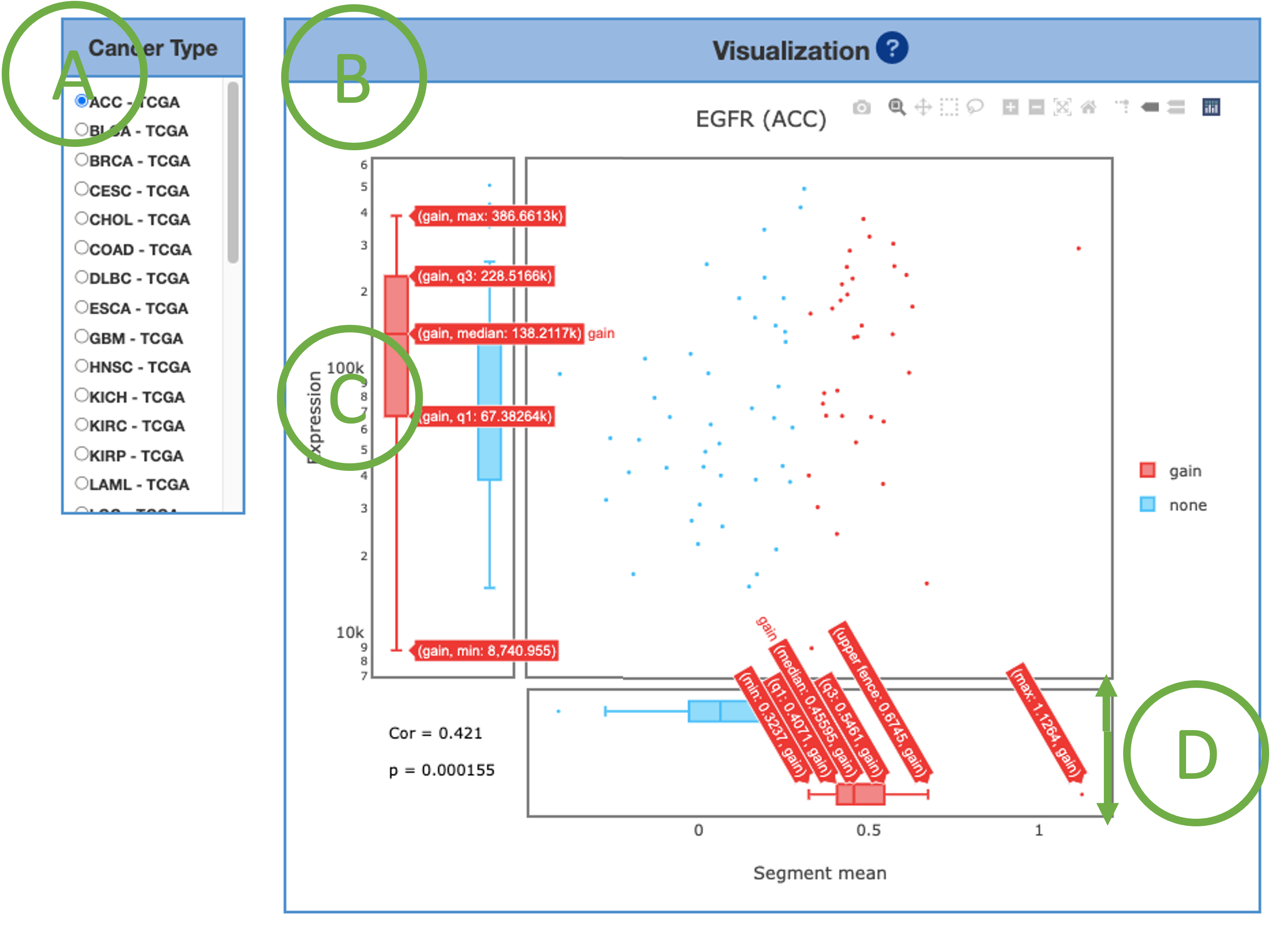
This graph provides a combination of scatter plot and boxplots to show a more detailed view of the CNV distribution and correlation in each cancer type. Select the desired cancer type (A) on the table to generate the corresponding graph on the right (B). The Visualization implies the message that whether the expression has a difference if CNV gain or loss (C). The copy number values are transformed into segment mean values (D), which are equal to log2(copy-number/ 2). Diploid regions will have a segment mean of zero (-0.3 – 0.3), amplified regions will have positive values (>0.3), and deletions will have negative values (<-0.3).
3.3.3. CNV Table
The gene is analyzed by two CNV tools: iGC and diggit for different cancer types/datasets. The CNV table provides a summarized information, including Cancer type abbreviation, Gene symbol, ENSG, statistic data: (1)iGC - Gain p-value, Gain FDR, Loss p-value, Loss FDR, Gain sample proportion, Normal sample proportion, Loss sample proportion, Gain log2FC, Loss log2FC, (2)DIGGIT - p-value, (3)Segment mean vs. expression - Spearman correlation coefficient, Spearman p-value.
3.4. Gene Methylation
3.4.1. Methylation status in all cancer
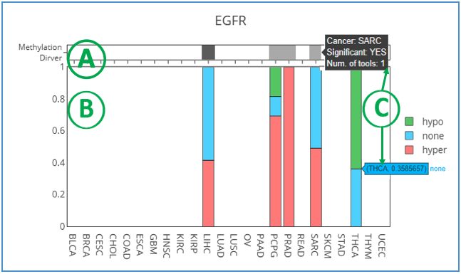
This graph shows the methylation status of a user-selected gene in several cancer types. Each gene is defined by two methylation tools: methylmix (1) and ELMER (2). The sample proportion is shown in the plot when the cancer is identified by one or both of the tools. On top of the bar chart, Methylation Driver presents the number of tools that identified the hyper/hypomethylation in the specific cancer types and whether it is significant. Dark grey represents that the methylation driver is identified by two tools. Light grey is identified only by methylmix. The bottom of the chart indicates the methylation status. The green color represents hypomethylation; red is hypermethylation; blue represents no methylation. More details related to analyses and tools can be found in tooltips when moving the mouse over the bars.
Reference:
(1) Cedoz, P.L., Prunello, M., Brennan, K. and Gevaert, O. (2018) MethylMix 2.0: an R package for identifying DNA methylation genes. Bioinformatics, 34, 3044-3046.
(2) Silva, T.C., Coetzee, S.G., Gull, N., Yao, L., Hazelett, D.J., Noushmehr, H., Lin, D.C. and Berman, B.P. (2019) ELMER v.2: an R/Bioconductor package to reconstruct gene regulatory networks from DNA methylation and transcriptome profiles. Bioinformatics, 35, 1974-1977.
3.4.2. Visualization of each cancer types
This graph provides a combination of scatter plot and boxplots to show a more detailed view of the methylation distribution and correlation in each cancer type. Select the desired cancer type on table (A) to generate the corresponding graph on the right (B). Beta values (β) are the ratio of intensities between methylated and unmethylated alleles (D). β are ranged from zero to one, 0 being unmethylated, and 1 fully methylated.
As always, the tooltips provide information, such as maximum, minimum, median, q1 and q3 when moving mouse over (C).
3.4.3. Methylation Table
The gene is analyzed by two methylation tools: methylmix and ELMER for different cancer types/datasets. Here is the summarized information, including Cancer type abbreviation, Gene symbol, ENSG, statistic data: (1) MethylMix - Hyper percent, Hypo percent, None percent, (2) ELMER - Probe, Distance, Adjust p-value, Methylation type, (3) Beta-value vs. expression - Spearman correlation coefficient, Spearman p-value.
3.5. Gene Survival
The Gene Survival function provides visualizations to illustrate the survival probability of a user-selected gene across multiple cancer types.
3.5.1. Single Gene Survival
This table provides detailed survival information of a single gene and also serves as a control panel to produce the Kaplan-Meier plot for visualization. Select the desired cancer type on the table to generate a corresponding Kaplan-Meier plot below. Cancer types are abbreviated according to TCGA shown as below. We also provide 4 types of survival endpoint, including OS (Overall survival), DFI (disease-free interval), PFI (progression-free interval), and DSS (disease-specific survival). The cutoff value is the stratified method, which can be either mean or median for analyses and plots.
3.5.2. Kaplan-Meier plot
By selecting the cancer type in the table above, the patient samples are stratified into 2 groups: samples with highly expressed genes (red) and samples with lowly expressed genes (green). Y-axis is survival probability. The X-axis is the months of survival period. Log-Rank P-value and Hazard Ration are provided on the top of plots.
3.5.3. Synergistic effect
The Gene Survival network illustrates the synergistic effect of a user-selected gene and its related genes. The synergistic effect is defined by the HR of the user-selected gene and its related genes. If the HR of two genes is greater than 1.5 folds of each, these two genes are identified to have a synergistic effect, and are further divided into 2 levels – 1.5 folds and 2 folds; each with a positive and negative direction of HR. Toggle the options within Gene databases, Synergistic effect, and Direction of HR to filter the network based on selected conditions. To search for specific networks of genes, type gene name in the search box on the top left corner.
3.5.4. Survival of Synergistic effect
This section provides all gene pairs (a user-selected genes and its related genes) with HR fold change greater than each single gene in both directions even though only more than 1.5 fold changes are considered to have a synergistic effect between them. For each gene pair, the patients are stratified to two groups based on their expression median. The groups of patients are then compared on their 5-year overall survival (OS) probability over months, as shown in the plots.
A table of cancer types with gene pairs is provided for each direction of HR (>1 or <1). Select the desired gene pairs on the table to generate the corresponding survival plots on the right. Patients are stratified to groups for comparison:
All.high (purple) = patients with high expression in both gene1 and gene2
All.low (red) = patients with low expression in both gene 1 and gene 2
Low.high (green) = patients with low expression in gene 1 but high expression in gene2
High.low (blue) = patients with high expression in gene 1 but low expression in gene 2
Other = patients with other combinations rather than all high
As always, moving the mouse over the survival line, the details of months and survival probabilities will be shown in tooltips. Hazard ratio and Log-Rank P value are also provided on the top of the graphs.
3.6. Gene miRNA
The Gene miRNA function provides visualizations to illustrate the relations between user-selected genes and miRNAs across multiple cancer types.
3.6.1. miRNA-gene network
The Gene-miRNA network illustrates the relations between a user-selected gene and miRNAs across multiple cancer types. The interactions are defined by 12 prediction tools, including DIANA-microT (2), MicroT4 (3), miRBridge (4), miRDB (5), miRMap (6), PITA (7), RNAhybrid (8), TargetScan (9), PICTAR2 (10), RNA22 (11), miRWalk (12) and miRanda (13), or experimental validations recorded in miRTarBase (http://mirtarbase.mbc.nctu.edu.tw/php/index.php). We incorporated the data from our previous database, YM500v3 (9), to DriverDBv4 to establish the relations with negative correlation coefficients between driver genes and miRNAs. By selecting the validated option, the experimental validation network will be shown in the plot. Validated relations are represented by solid lines; predicted relations are represented by dotted lines. The width of lines indicates the number of cancers supporting the relations of the user-selected gene and miRNAs. Predicted relations can be further filtered by a minimum of 6, 8, or 10 tools. The search bar on the left can directly input the name of gene. By directly clicking on the node, specific networks related to the selected gene can be viewed individually. The green node represents gene. The yellow node represents miRNA.
3.6.2. Gene-miRNA table
The Gene-miRNA table provides detailed analytic information that comprises Cancer type abbreviation, miRNA, Gene symbol, ENSG, Validated, Number of tools, Pearson correlation coefficient, Pearson p-value, Spearman correlation coefficient, Spearman p-value, Kendall correlation coefficient, Kendall p-value.
3.7. Gene Protein
The The Gene Protein function provides visualizations to illustrate the protein expression of a user-selected gene across multiple cancer types by PTMs, mutation class, and stage. Users can easily view results grouped by different criteria by switching between tabs.
3.7.1. By PTMs
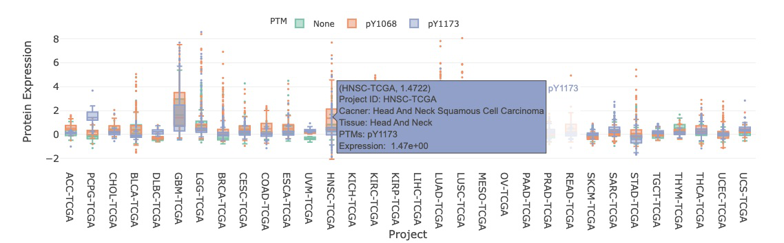
3.7.1.1. Visualization of all cancer types
The boxplot shows the distribution of protein expression of a user-selected gene across all cancer types. The expression is grouped by PTM (Post-translational modification).
By clicking on the PTM legends, you can show or hide the corresponding results. Hovering over the boxes, you can view additional information and statistical values.
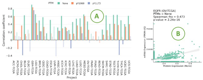
3.7.1.2. Visualization of mRNA-protein regulation
The bar chart illustrates the relationship between mRNA and protein levels across cancer types by Spearman correlation.
Click on a specific bar in the bar char (A) to view the corresponding correlation scatter plot on the right side (B).
Hovering over the boxes, you can view additional information and statistical values.
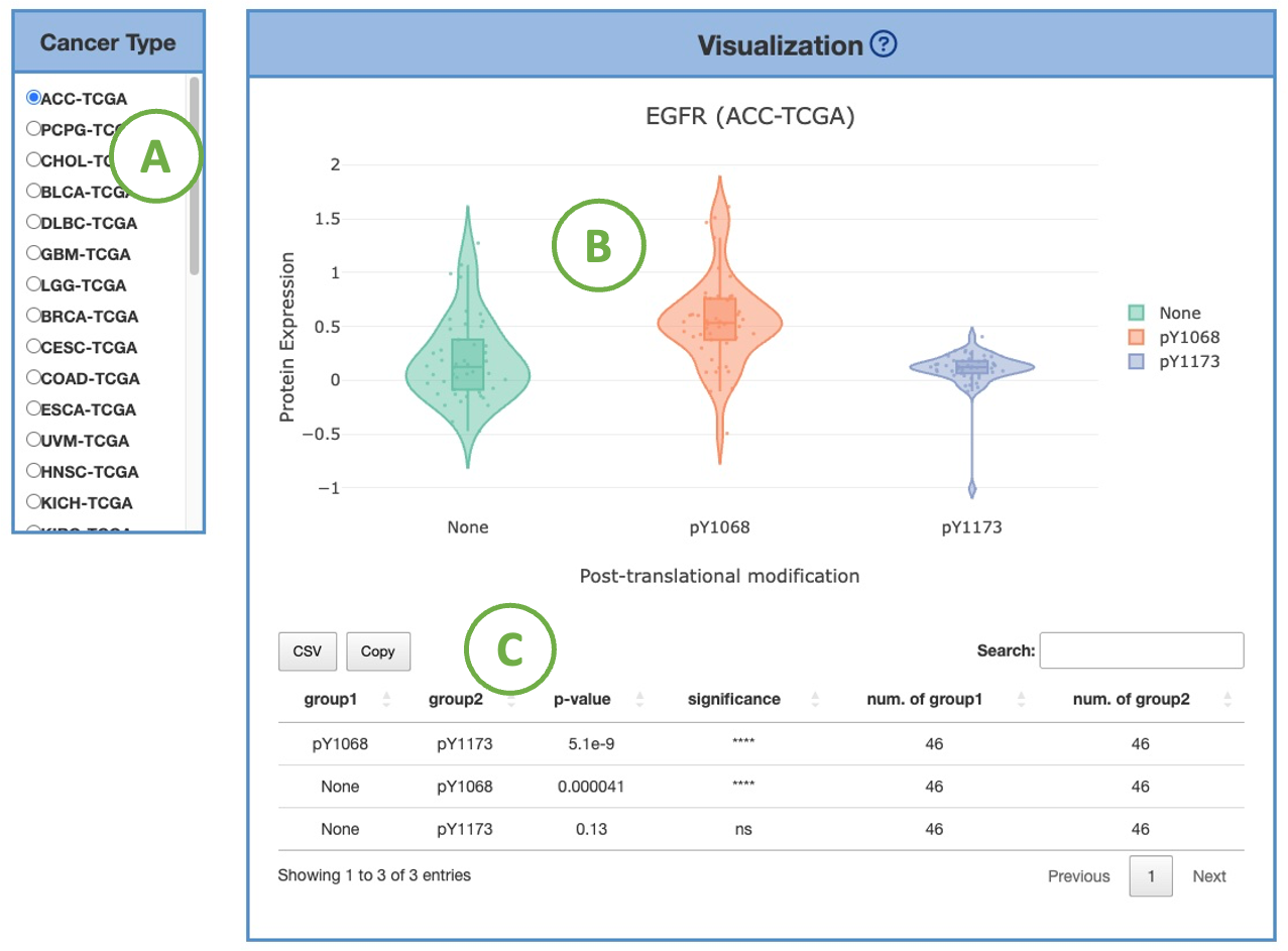
3.7.1.3. Visualization by PTMs
This plot provides a more detailed view of the distribution of protein expression of a particular cancer type.
Selecting the desired cancer type from the table on the left (A) will generate a corresponding expression plot (B) on the right.
A table displaying the relevant statistical values will also be generated below (C).
To focus on a specific PTM (Post-translational modification), you can click on the legends within the plot to show or hide the corresponding results.
Furthermore, hovering over the plot provides more detailed information about a specific PTM.
3.7.2. By mutation
3.7.2.1. Visualization of all cancer types
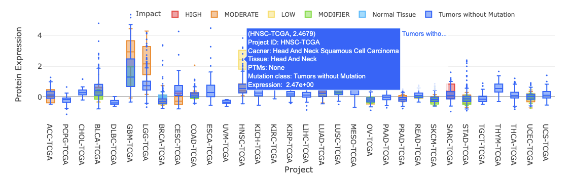
The boxplot shows the distribution of protein expression of a user-selected gene across all cancer types.
The boxplot is displayed according to user-selected PTM (Post-translational modification) on the drop-down menu.
The expression is grouped by mutation classes. You can show or hide the corresponding results by clicking on the plot legends.
Additional information and statistical values are shown by hovering over the individual boxes.
3.7.2.2. Visualization of mRNA-protein regulation
The bar chart illustrates the relationship between mRNA and protein levels across cancer types by Spearman correlation.
The bar chart is displayed according to user-selected PTM (Post-translational modification) on the drop-down menu.
Click on a specific bar in the bar char (A) to view the corresponding correlation scatter plot on the right side (B). Hover over the boxes to view additional information and statistical values.
3.7.2.3. Visualization by mutation
This plot provides a more detailed view of the distribution of protein expression of a particular cancer type.
Selecting the desired cancer type from the table on the left (A) will generate a corresponding expression plot (B) on the right.
A table displaying the relevant statistical values will also be generated below (C).
To focus on a specific mutation class, you can click on the legends within the plot to show or hide the corresponding results.
Furthermore, hovering over the plot provides more detailed information about a specific mutation class.
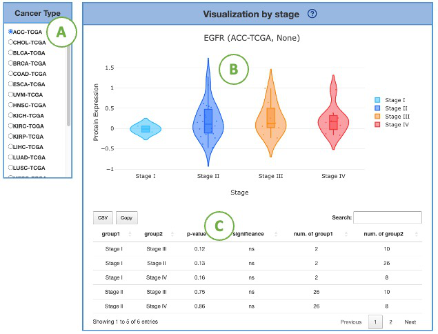
3.7.3. By stage
3.7.3.1. Visualization of all cancer types
The boxplot shows the distribution of protein expression of a user-selected gene across all cancer types.
The boxplot is displayed according to user-selected PTM (Post-translational modification) on the drop-down menu. The expression is grouped by stages. You can show or hide the corresponding results by clicking on the plot legends.
Additional information and statistical values are shown by hovering over the individual boxes.
3.7.3.2. Visualization of mRNA-protein regulation
The bar chart illustrates the relationship between mRNA and protein levels across cancer types by Spearman correlation.
The bar chart is displayed according to user-selected PTM (Post-translational modification) on the drop-down menu.
Click on a specific bar in the bar char (A) to view the corresponding correlation scatter plot on the right side (B).
Hover over the boxes to view additional information and statistical values.
3.7.3.3. Visualization by stage
This plot provides a more detailed view of the distribution of protein expression of a particular cancer type.
Selecting the desired cancer type from the table on the left (A) will generate a corresponding expression plot (B) on the right.
A table displaying the relevant statistical values will also be generated below (C).
To focus on a specific stage, you can click on the legends within the plot to show or hide the corresponding results.
Furthermore, hovering over the plot provides more detailed information about a specific stage.
3.8. Gene Multi-omics
The Gene Multi-omics function provides visualizations to illustrate the user-selected gene by multi-omics data across multiple cancer types.
3.8.1. Visualization of multi-omics integration
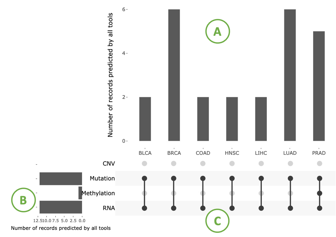
This plot illustrates the distribution of records predicted by tools across cancer types and omics. It also reveals the importance of a user-selected gene in multi-omics data.
This plot consists of three sections: a bar chart in the top-right corner (A) showing the distribution of records predicted by tools across cancer types, a bar chart in the left-bottom corner (B) displaying the distribution of records predicted by tools across multi-omics, and a right-bottom combination matrix (C) where a solid dot indicates that the gene is important in that omic.
Hovering over bars provides detailed information.
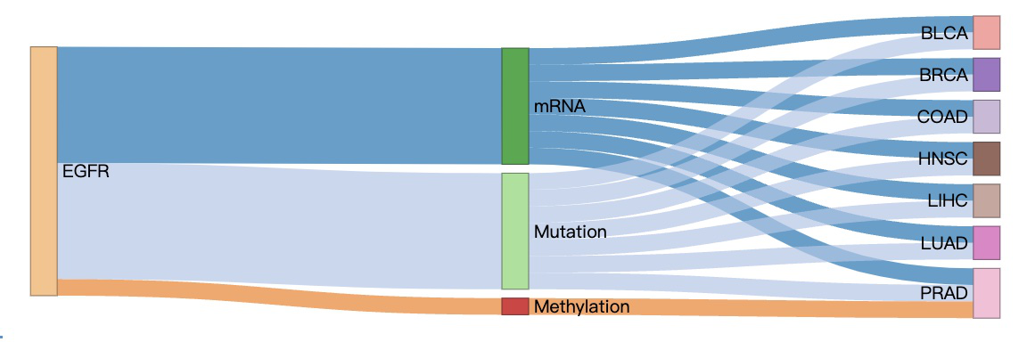
3.8.2. Visualization of omics connection
This diagram illustrates the associations between a user-selected gene, multi-omics, and cancer types. Nodes in the graph with more connections indicate a higher level of influence.
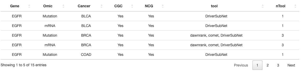
3.8.3. List of multi-omics driver events
The table presents comprehensive details, including the omics, cancer type, gene status in the Cancer Gene Census (CGC) or Network of Cancer Genes (NCG), the identification tool used, and the corresponding tool counts.
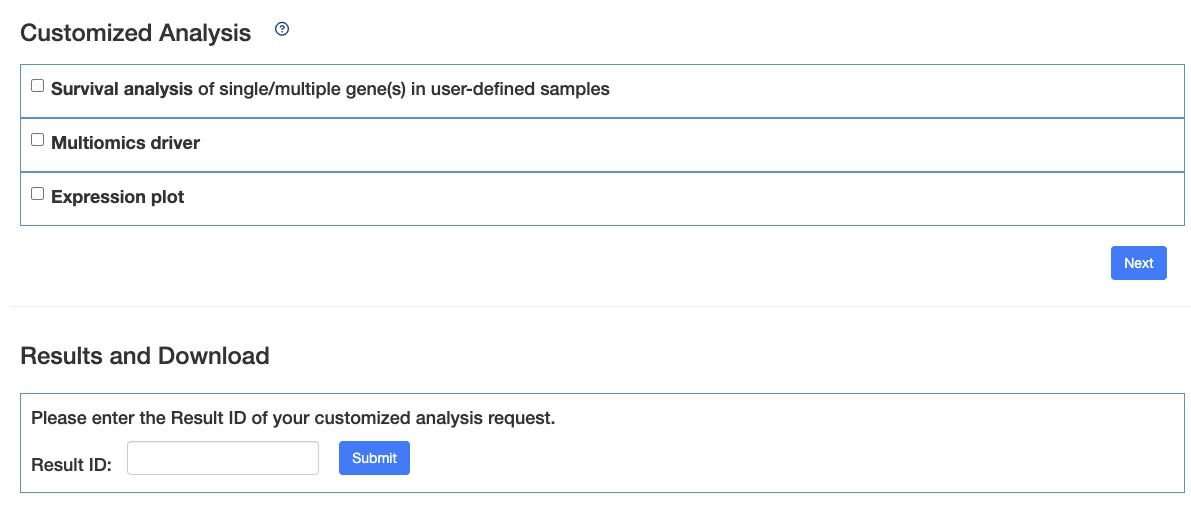
4. Section Three - Customized Analysis
The ‘Customized-Analysis’ function provides three analyses: survival analysis, multi-omics driver analysis, and subgroup expression analysis.
In survival analysis, researchers can stratify patients using two approaches: by expression levels or by mutation status.
The multi-omics driver analysis identifies and explores the multi-omics drivers associated with user-defined groups of patients.
The subgroup analysis visualizes gene expression patterns concerning specific clinical factors.
Please choose an analysis from the selection panel to begin your analysis.
4.1. Survival Analysis
Survival Analysis allows researchers to investigate the co-occurring events affecting patient survival by entering single or more targets and defining the subgroup of specific patients. We offer two analysis methods, Survival analysis according to MUTATION and Survival analysis according to EXPRESSION. In addition, we provide three types of stratification methods (All.high vs. Others; High vs. Low; By num. of high) in Survival by EXPRESSION and two types (Mutation vs. Wild type; By num. of mutant gene) in Survival by MUTATION. We also provide four categories of survival endpoint, including overall survival (OS), progression-free interval (PFI), disease-free interval (DFI) and disease-specific survival (DSS), and other critical survival analysis related factors in this function for users to select.
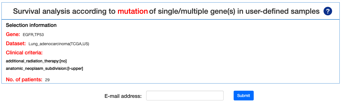
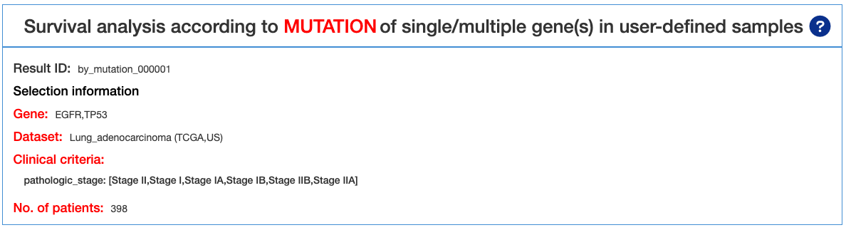
4.1.1. Survival analysis according to MUTATION
In this section, a series of customized factors for analyses can be chosen, leading to the results of survival analysis according to MUTATION of single/multiple gene(s) in user-defined samples.
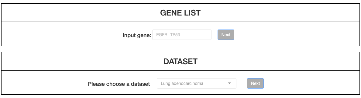
Firstly, up to 5 genes can be typed in the left column. By pressing Check, invalid genes will be removed, and only valid genes will be subsequently analyzed. Then, click NEXT to select a dataset from the drop down menu.
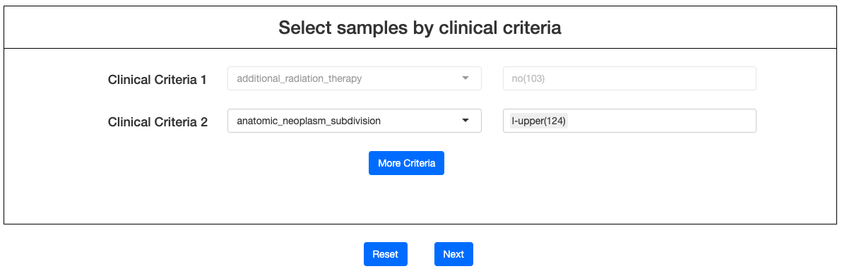
Click NEXT to select various types of clinical criteria from drop-down menu. After criteria were chosen, advanced options will appear on the right columns. Users may then click on the options to filter samples (must include at least 20 patients for a successful calculation). More criteria can be added by clicking More Criteria. After samples are selected, click NEXT to enter the result page.
After submitting the final quest, users will receive a notification email with a Result ID. This allows users to explore the results of ‘Customized-analysis’ in the ‘Result and Download’ section when the calculation is completed.
4.1.1.1. Results Page Navigation
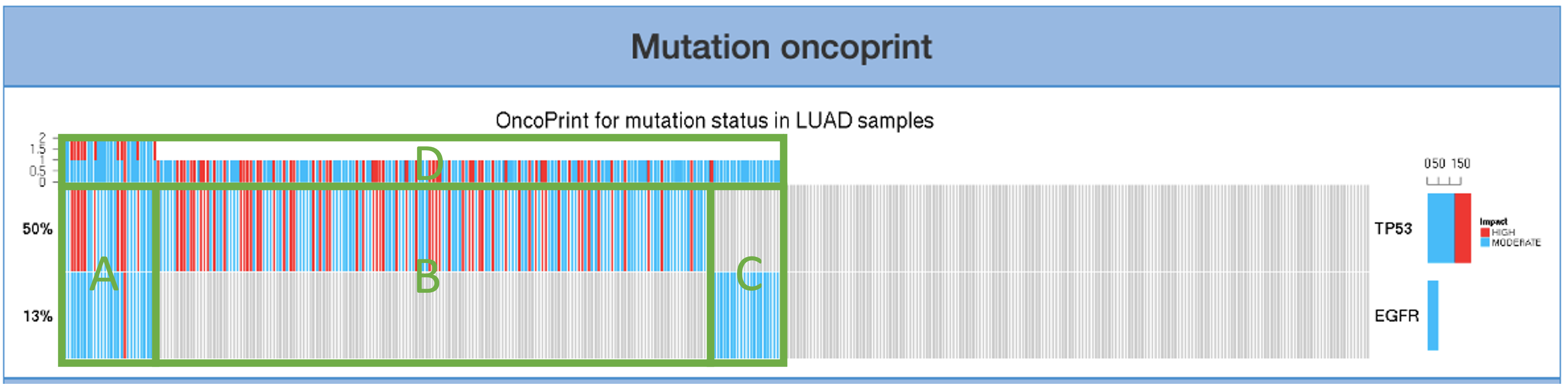
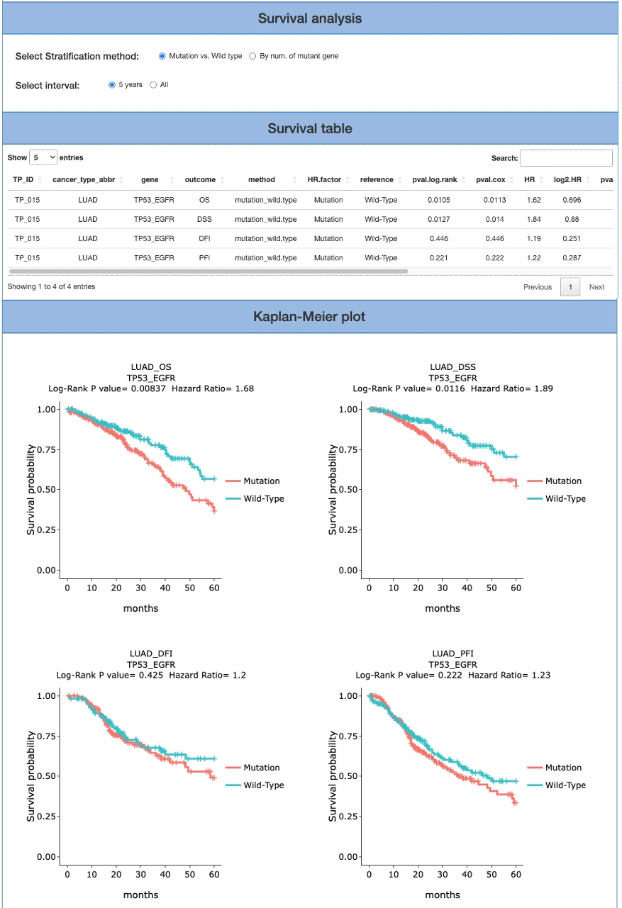
This is the result page of Survival analysis by MUTATION. Base on the input and the selected criteria, we offer a series of Survival analysis, such as Mutation OncoPrint, Survival analysis, Survival table, Kaplan-Meier plot.
Mutation oncoprint introduces the co-occurrence status of the user-assigned gene. The mutation that has a high impact is colored in red. The moderate-impact mutation is colored in blue. Area A that represents samples with both gene mutations appears leftmost in the bar. Area B and C display the proportion of samples that only have one mutation. Area D indicates the summary of co- occurrence. Area E shows the percentage of the impact level of each gene.
The Survival analysis section provides two stratification methods: mutation v.s wildtype and By num. of mutant gene; as well as interval: 5 years and All. In the final two columns of the report, four categories of clinical endpoints (OS, PFI, DFI and DSS) are also presented in the Survival table and Kaplan-Meier plot. Note that the Kaplan-Meier plot cannot be generated if not enough samples/events (either ‘sample’ or ‘events’ does not exceed 0) were selected for the analysis.
4.1.2. Survival analysis according to EXPRESSION
With the functions of Survival analysis by expression, users may investigate the co- expression events affecting patient survival by entering more than one targets and defining the subgroup of specific patients. When more than one gene are selected for survival analysis by expression, three stratification methods are available (all high vs others, high vs low, num. of high). For more details of the operation, please refer to section 4.1.1 Survival analysis according to MUTATION .
4.1.2.1. Results Page Navigation
This is the result page of Survival analysis by expression. In this section, we offer diverse selected criteria for Survival analysis, such as cutoff (mean, median), stratification method (All high vs others, High vs low, and Num. of high), and interval (5 years, All).
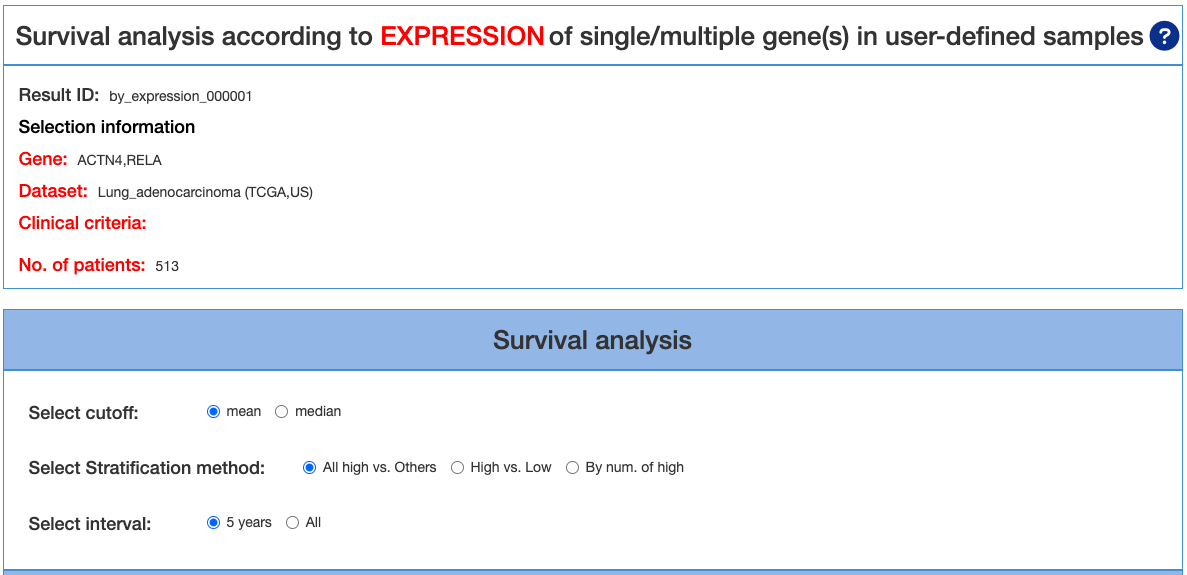
The analytical report consists of four categories of clinical endpoints (OS, PFI, DFI and DSS) for Survival table and Kaplan-Meier plot. Note that the Kaplan-Meier plot cannot be generated if not enough samples/events (either ‘sample’ or ‘events’ does not exceed 0) were selected for the analysis.
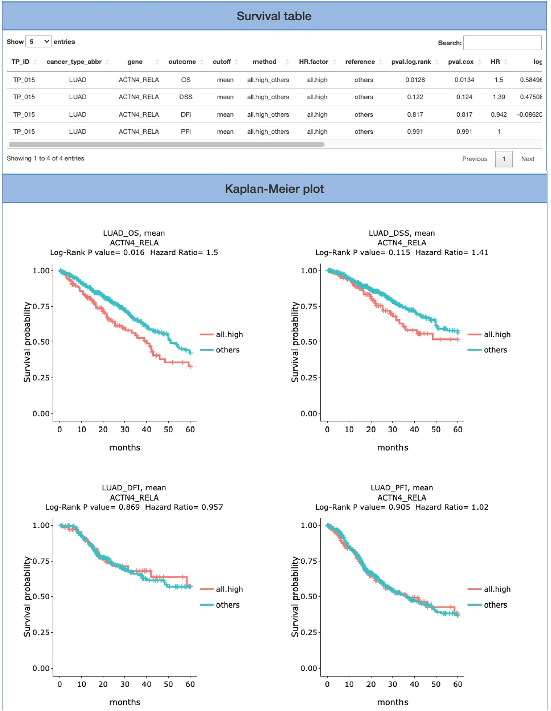
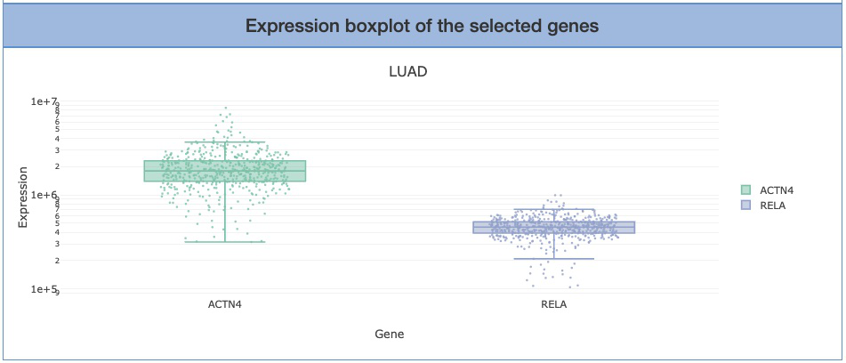
Expression boxplot of the selected genes shows the genes that users input on the first page. The Y-axis is the expression level of selected genes. Hover the mouse over the dots on the plot to view the exact values of expression level.
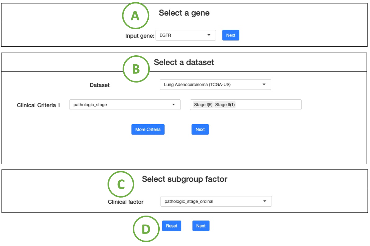
4.2. Multi-omics driver analysis
Multi-omics driver analysis, identifies driver events across multiple omics in the user-selected cancer dataset, focusing on user-defined Group 1 and Group 2 patients based on specific clinical criteria.
The process of setting the criteria is described in the sequential order indicated in the figure below.
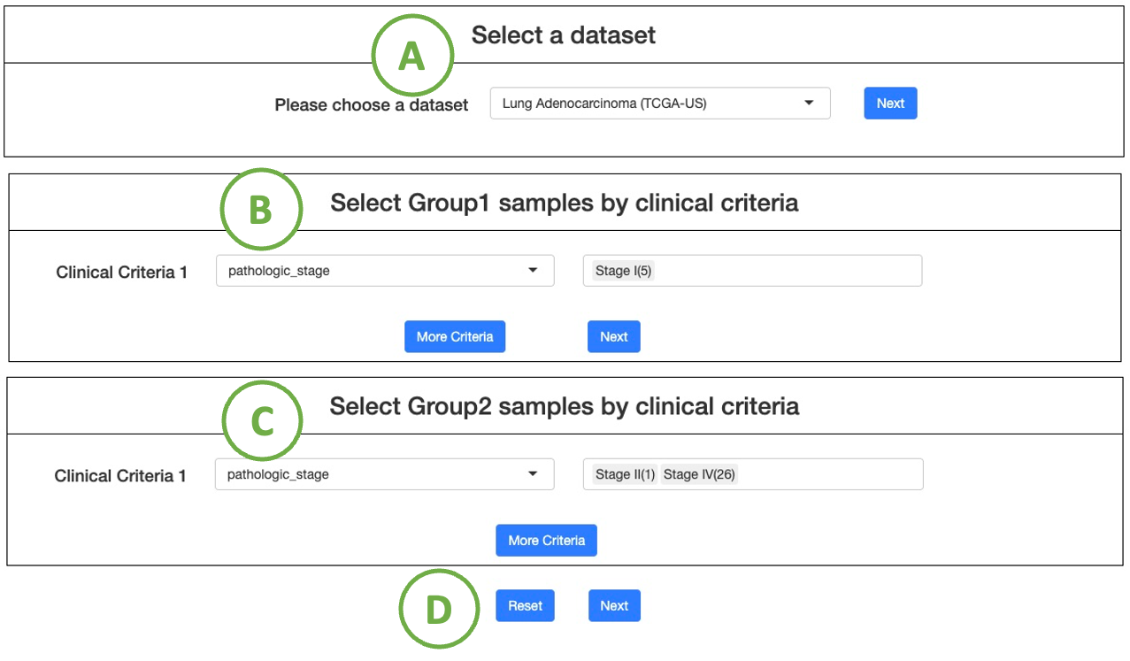
- Choose a cancer dataset from the drop-down list, and click "Next" to proceed.
- Select interested clinical criteria for group 1 samples from the drop-down list. Then set further criteria by the selection panel next to it. (Note: Click the ”More Criteria” button to add more criteria.)
After all the setting is done, click the “Next” button to proceed. - Select interested clinical criteria for group 2 samples from the drop-down list, and then you can set further criteria by the selection panel next to it.
(Note: If you want to set more criteria, click on the button ”More Criteria” to add a new one)
After all the setting is done, click the “Next” button to proceed. - After all the setting is done, click “Next” button to proceed.
(Note To reset the settings, click the "Reset" button.)
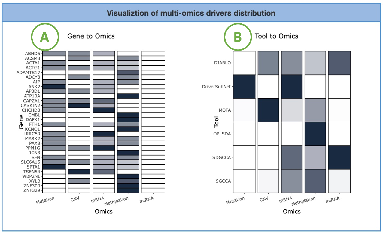
4.2.1. Visualiztion of multi-omics drivers distribution
The heatmaps display the adopted tools and the identified driver genes of five omics, mRNA, miRNA, CNV, mutation, and methylation.
The left heatmap (A) visualizes the correlation between genes and omics. The x-axis represents the omics level, while the y-axis represents the gene symbol. By hovering over a specific cell in the heatmap, you can view the number of tools identifying that particular gene.
The right heatmap (B) illustrates the association between tools and omics. The x-axis represents the omics level, while the y-axis represents the identification tools. By hovering over a specific cell in the heatmap, you can view the proportion in omics of the tool.
4.2.2. Drivers defined by multi-omics tools
The bar charts visualize the number of genes selected by multi-omics tools.
The left chart (A) displays the top genes selected by the most tools. The x-axis represents the number of tools, while the y-axis represents the gene symbol. The bar colors distinguish the four omics. Hovering over a bar lets you view the number of tools identifying that specific gene of a particular omics.
The right chart (B) shows the distribution of the selected gene number based on different tool counts. The x-axis represents the number of tools, while the y-axis represents the number of genes. By hovering over a bar, you can view the number of genes identified corresponding to a specific tool count.
4.2.3. Multi-omics driver related biological functions
The diagram (B) illustrates the associations between a specific cancer type's multi-omics, genes, and Gene Ontology (GO) terms.
You can switch the radio button (A) to view the result of different gene datasets. Nodes in the graph with more connections indicate a higher level of influence.
Detailed information and results are listed in the table (C) below the diagram.
4.3. Subgroup expression analysis
Subgroup expression analysis, visualizes the expression patterns of a user-selected gene in a specific cancer subpopulation across a user-defined category.
The process of setting the criteria is described in the sequential order indicated in the figure below.
- Choose a input gene, and click "Next" to proceed.
- Choose a cancer dataset from the drop-down list, and select interested clinical criteria from the drop-down list.
Then set further criteria by the selection panel next to it. (Note: Click the ”More Criteria” button to add more criteria.)
After all the setting is done, click the “Next” button to proceed. - Select a subgroup factor from the drop-down list.
-
After all the setting is done, click the “Next” button to proceed.
(Note To reset the settings, click the "Reset" button.)
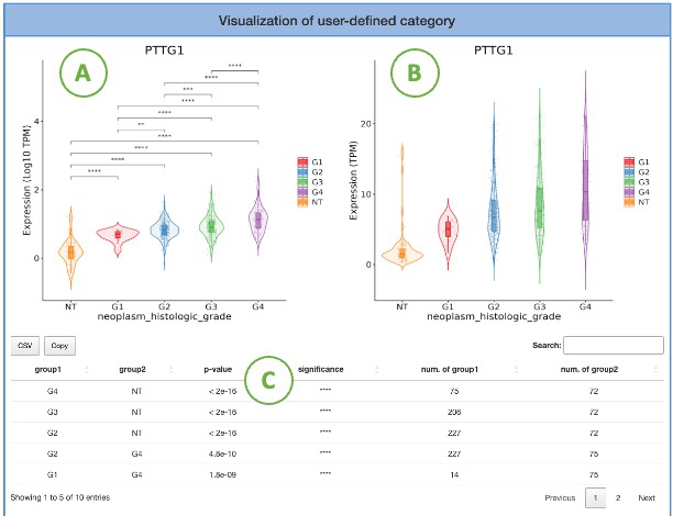
4.3.1. Visualization of user-defined category
This section provides the distribution of gene expression for a user-selected gene in a specific cancer type, grouped by user-defined subgroup factor. The left plot (A) displays the gene expression of the right plot (B) on the log10 TPM scale. The groups with statistical significance are indicated by asterisks (*). Additionally, a table (C) displays the relevant information and statistical values.
5. Section Four - Download
DriverBDv4 provides three summaries of driver genes for users to download: Mutation drivers defined by 9 mutation tools in various cancers, CNV drivers defined by both 2 tools in various cancers, methylation drivers defined by both 2 tools in various cancers, and multi-omics drivers defined by 8 tools.
6. Section Fifth - Dataset
| Project Name | Cancer Name | Tissue |
| ACC-TCGA | Adrenocortical_carcinoma | Adrenal_gland |
| BLCA-CN-ICGC | Bladder_urothelial_carcinoma | Bladder |
| BLCA-TCGA | Bladder_urothelial_carcinoma | Bladder |
| BOCA-FR-ICGC | Ewing_sarcoma | Bone |
| BOCA-UK-ICGC | Osteosarcoma_chondrosarcoma_rare_subtypes | Bone |
| BPLL-FR-ICGC | B_Cell_Prolymphocytic_Leukemia | Blood |
| BRCA-EU-ICGC | Breast_carcinoma | Breast |
| BRCA-FR-ICGC | Breast_carcinoma | Breast |
| BRCA-KR-ICGC | Breast_carcinoma | Breast |
| BRCA-SCANB | Breast_carcinoma | Breast |
| BRCA-TCGA | Breast_carcinoma | Breast |
| BRCA-UK-ICGC | Breast_carcinoma | Breast |
| BTCA-JP-ICGC | Biliary_Tract_cancer | Gall bladder |
| BTCA-SG-ICGC | Biliary_Tract_cancer | Gall bladder |
| CESC-TCGA | Cervical_squamous_cell_carcinoma | Cervix |
| CHOL-TCGA | Cholangiocarcinoma | Bile_duct |
| LCLL-ES-ICGC | Chronic_Lymphocytic_Leukemia | Blood |
| CMDI-UK-ICGC | Chronic_myeloid_disorders | Blood |
| COAD-TCGA | Colon_adenocarcinoma | Colon |
| COCA-CN-ICGC | Colorectal_cancer | Colon |
| DLBC-TCGA | Lymphoid_neoplasm_diffuse_large_b_cell_lymphoma | Blood |
| PRAD-DE-ICGC | Prostate_adenocarcinoma | Prostate |
| ESCA-CN-ICGC | Esophageal_carcinoma_squamous | Esophagus |
| LIHC-CN-ICGC | Hepatocellular_carcinoma_HBV_associated | Liver |
| ESCA-TCGA | Esophageal_carcinoma | Esophagus |
| ESCA-UK-ICGC | Esophageal_carcinoma_adenocarcinoma | Esophagus |
| GACA-CN-ICGC | Gastric_cancer | Stomach |
| GACA-JP-ICGC | Gastric_cancer | Stomach |
| GBM-TCGA | Glioblastoma_multiforme | Brain |
| HNSC-TCGA | Head_and_neck_squamous_cell_carcinoma | Head_and_neck |
| KICH-TCGA | Kidney_chromophobe | Kidney |
| KIRC-TARGET | kidney_clear_cell_sarcoma | Kidney |
| KIRC-TCGA | Kidney_renal_clear_cell_carcinoma | Kidney |
| KIRP-TCGA | Kidney_renal_papillary_cell_carcinoma | Kidney |
| LALL-TARGET | Acute_lymphoblastic_leukemia | Blood |
| LAML-CN-ICGC | Acute_myeloid_leukemia | Blood |
| LAML-KR-ICGC | Acute_myeloid_leukemia | Blood |
| LAML-TARGET | Acute_myeloid_leukemia | Blood |
| LAML-TCGA | Acute_myeloid_leukemia | Blood |
| LGG-TCGA | Low_grade_glioma | Brain |
| LIHC-FR-ICGC | Hepatocellula_adenoma | Liver |
| LIHC-FR-ICGC | Hepatocellular_carcinoma_Secondary_to_alcohol_and_adiposity | Liver |
| LIHC-TCGA | Liver_hepatocellular_carcinoma | Liver |
| LIHC-FR-ICGC | Hepatocellular_carcinoma_Secondary_to_alcohol_and_adiposity | Liver |
| LIHC-JP-ICGC | Hepatocellular_carcinoma_Virus_associated | Liver |
| LIHC-JP-ICGC | Hepatocellular_carcinoma_Virus_associated | Liver |
| SARC-FR-ICGC | Leiomyosarcoma | Soft_tissue |
| LUAD-TCGA | Lung_adenocarcinoma | Lung |
| LUSC-CN-ICGC | Lung_squamous_cell_carcinoma | Lung |
| LU-KR-ICGC | Adenocarcinoma_Squamous_cell_carcinoma | Lung |
| LUSC-TCGA | Lung_squamous_cell_carcinoma | Lung |
| MALY-DE-ICGC | Germinal_center_B_cell_derived_lymphomas | Blood |
| SKCM-AU-ICGC | Skin_cutaneous_melanoma | Skin |
| MESO-TCGA | Mesothelioma | Mesothelium |
| HNSC-CN-ICGC | Nasopharyngeal_carcinoma | Nasopharynx |
| NBL-TARGET | Neuroblastoma | Nervous_system |
| NKTL-SG-ICGC | T_cell_and_NK_cell_lymphoma | Blood |
| HNSC-IN-ICGC | Oral_cancer | Head_and_neck |
| BOCA-TARGET | Osteosarcoma | Bone |
| OV-AU-ICGC | Ovarian_cancer | Ovary |
| OV-TCGA | Ovarian_serous_cystadenocarcinoma | Ovary |
| PAAD-TCGA | Pancreatic_adenocarcinoma | Pancreas |
| PAAD-AU-ICGC | Prostate_ductal_adenocarcinoma | Pancreas |
| PAAD-CA-ICGC | Prostate_ductal_adenocarcinoma | Pancreas |
| PAEN-AU-ICGC | Endocrine_neoplasms | Pancreas |
| PAEN-IT-ICGC | Endocrine_neoplasms | Pancreas |
| PBCA-DE-ICGC | Pediatric_Medulloblastoma_and_Pilocytic_Astrocytoma | Brain |
| PBCA-US-ICGC | Pediatric_Brain_Tumor | Brain |
| PCPG-TCGA | Pheochromocytoma_and_paraganglioma | Adrenal_gland |
| PEME-CA-ICGC | Pediatric_Medulloblastoma | Brain |
| PRAD-CA-ICGC | Prostate_adenocarcinoma | Prostate |
| PRAD-CN-ICGC | Prostate_adenocarcinoma | Prostate |
| PRAD-FR-ICGC | Prostate_adenocarcinoma | Prostate |
| PRAD-TCGA | Prostate_adenocarcinoma | Prostate |
| PRAD-UK-ICGC | Prostate_adenocarcinoma | Prostate |
| READ-TCGA | Rectum_adenocarcinoma | Rectum |
| KIRC-CN-ICGC | Kidney_renal_clear_cell_carcinoma | Kidney |
| RECA-EU-ICGC | Renal cell carcinoma (Focus on but not limited to clear cell subtype) | Kidney |
| RT-TARGET | Rhabdoid_tumors | Kidney |
| SARC-TCGA | Sarcoma | Soft_tissue |
| SKCM-BR-ICGC | Skin_cutaneous_melanoma | Skin |
| SKCM-TCGA | Skin_cutaneous_melanoma | Skin |
| STAD-TCGA | Stomach_adenocarcinoma | Stomach |
| TGCT-TCGA | Testicular_germ_cell_tumor | Testis |
| THCA-CN-ICGC | Thyroid_carcinoma | Head_and_neck |
| THCA-SA-ICGC | Thyroid_carcinoma | Head_and_neck |
| THCA-TCGA | Thyroid_carcinoma | Thyroid |
| THYM-TCGA | Thymoma | Thymus |
| UCEC-TCGA | Uterine_corpus_endometrial_carcinoma | Uterus |
| UCS-TCGA | Uterine_carcinosarcoma | Uterus |
| UCS-FR-ICGC | Uterine_carcinosarcoma | Uterus |
| UVM-TCGA | Uveal_melanoma | Skin |
| WT-TARGET | Wilms_Tumor | Kidney |